
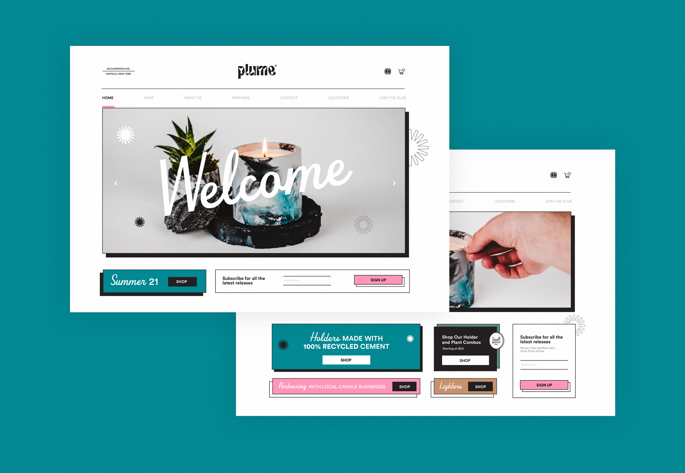
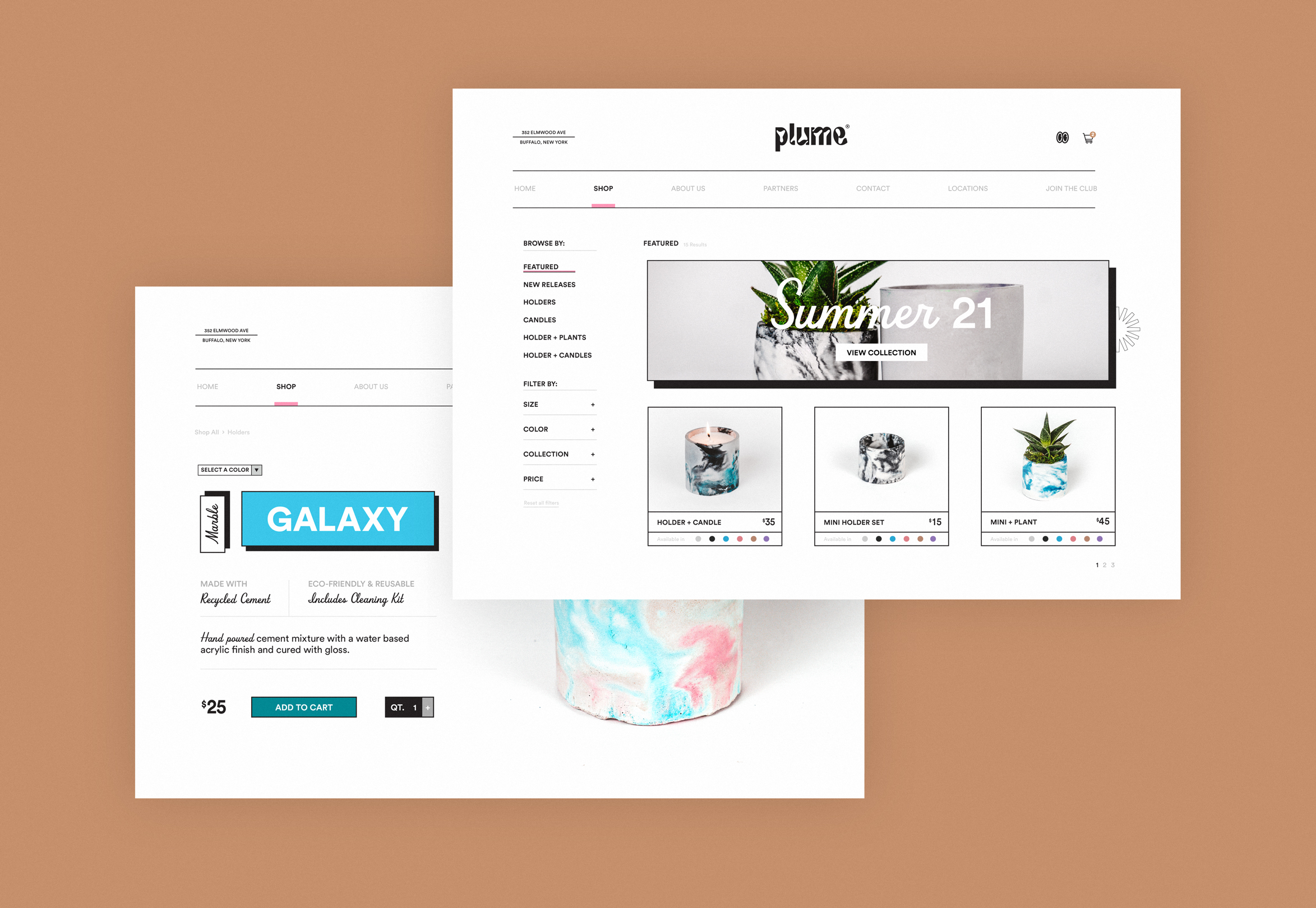
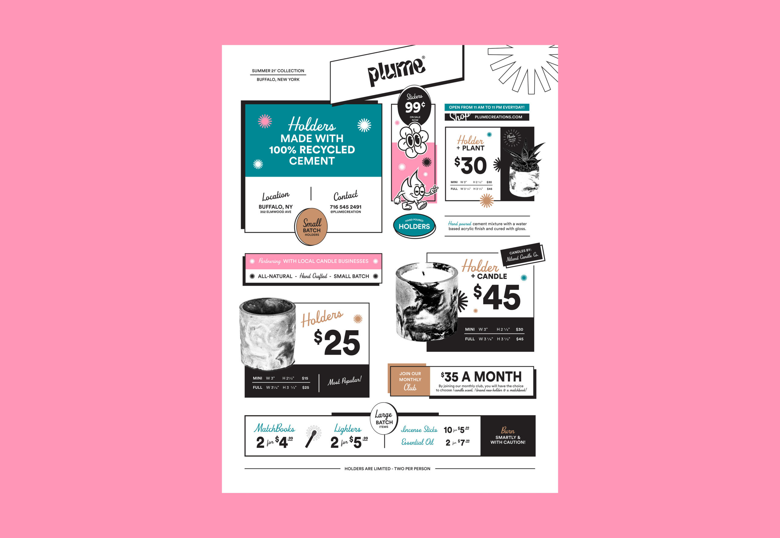
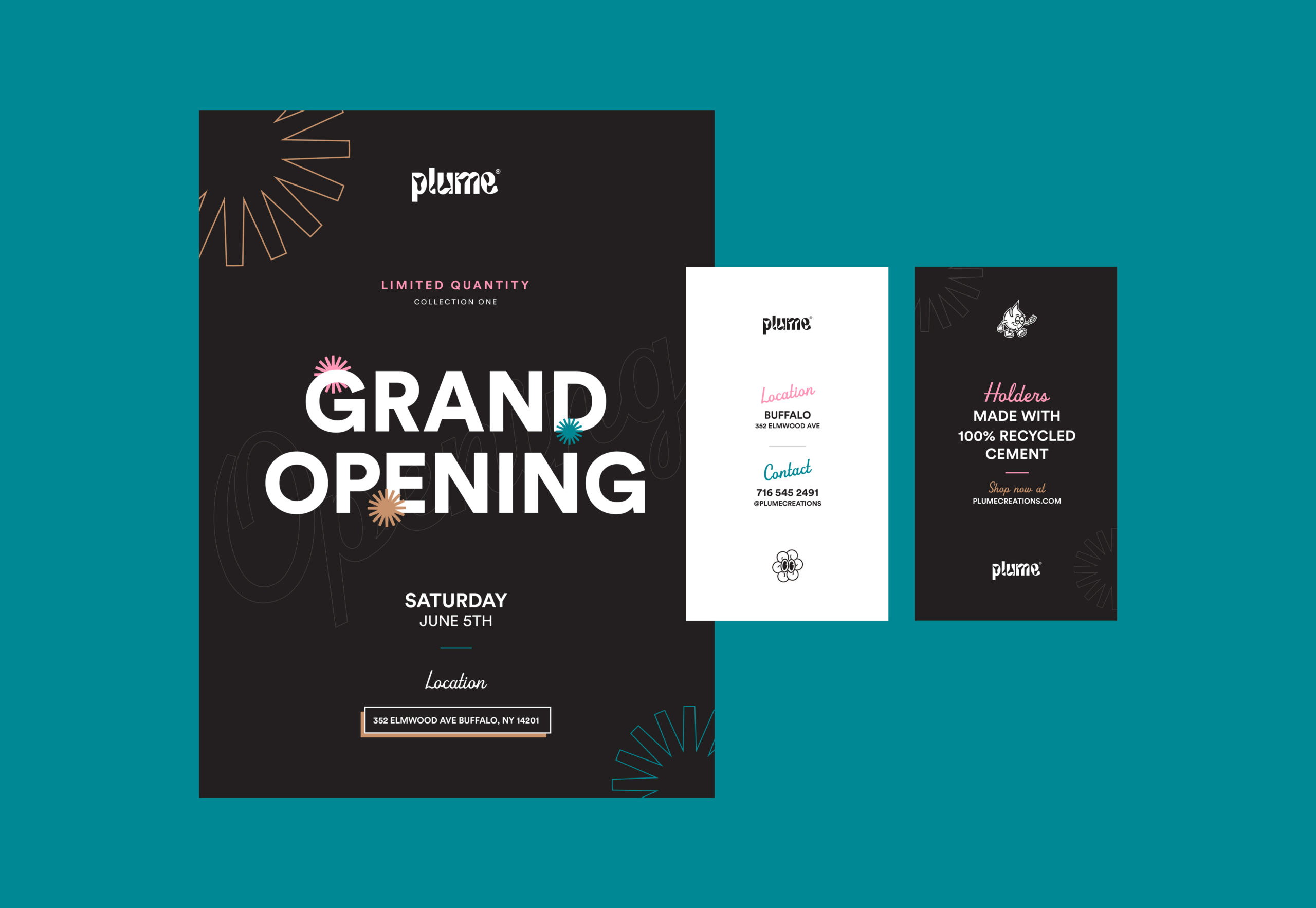
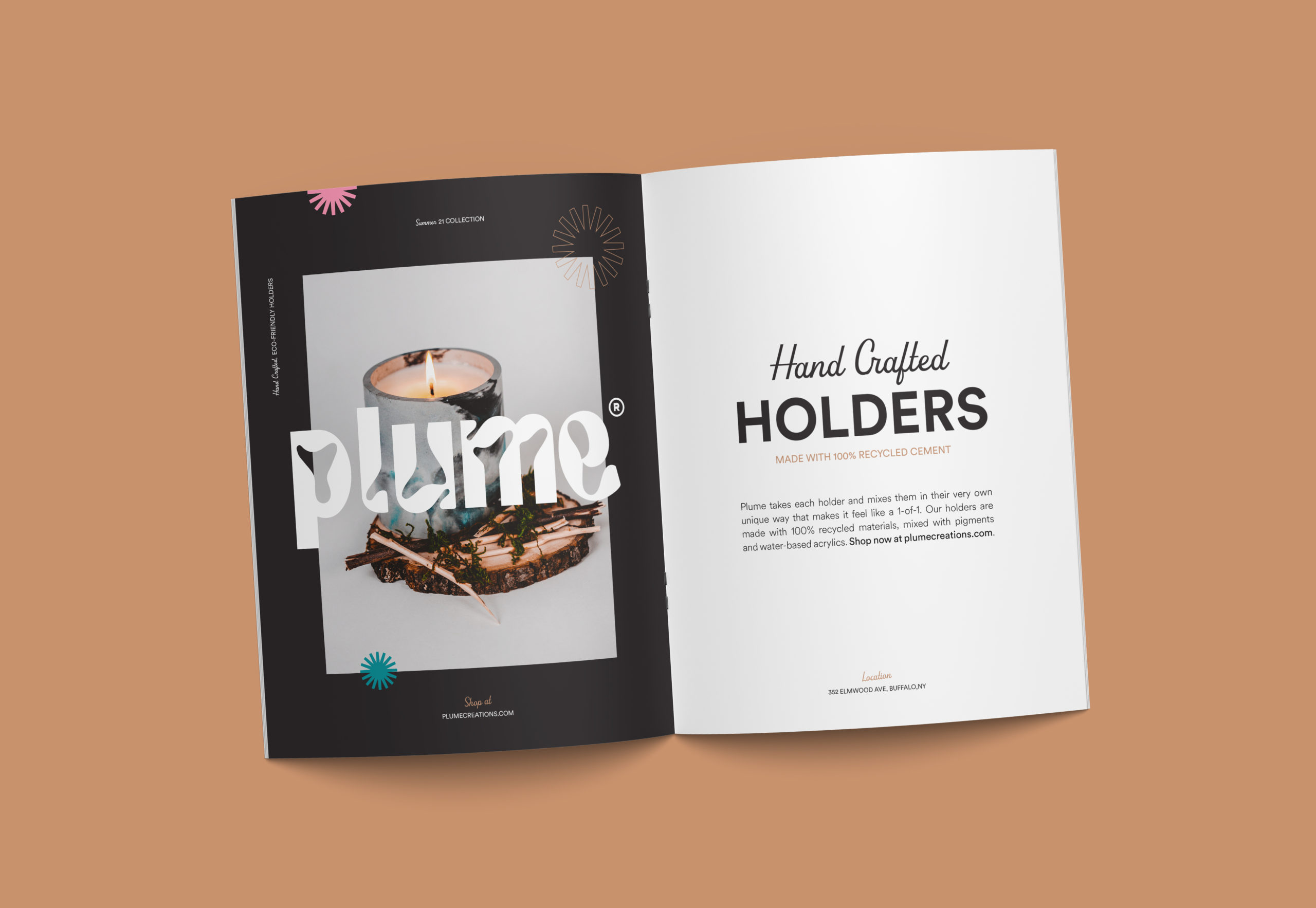
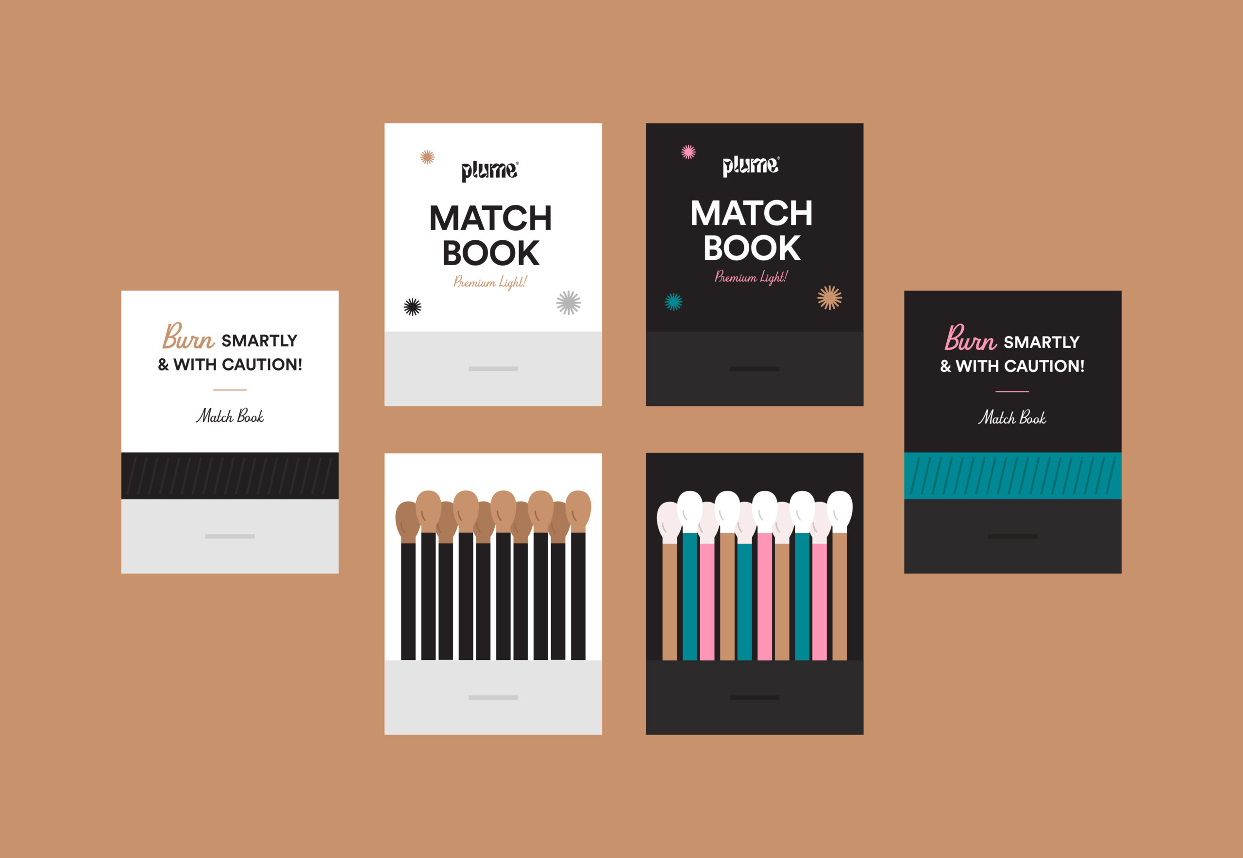
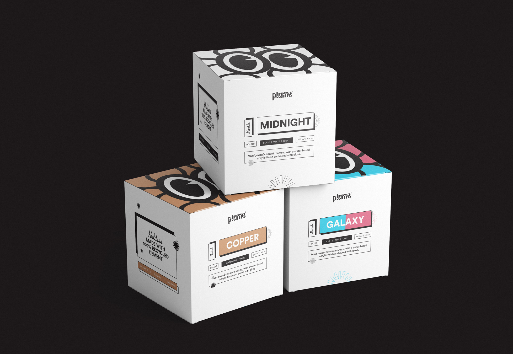
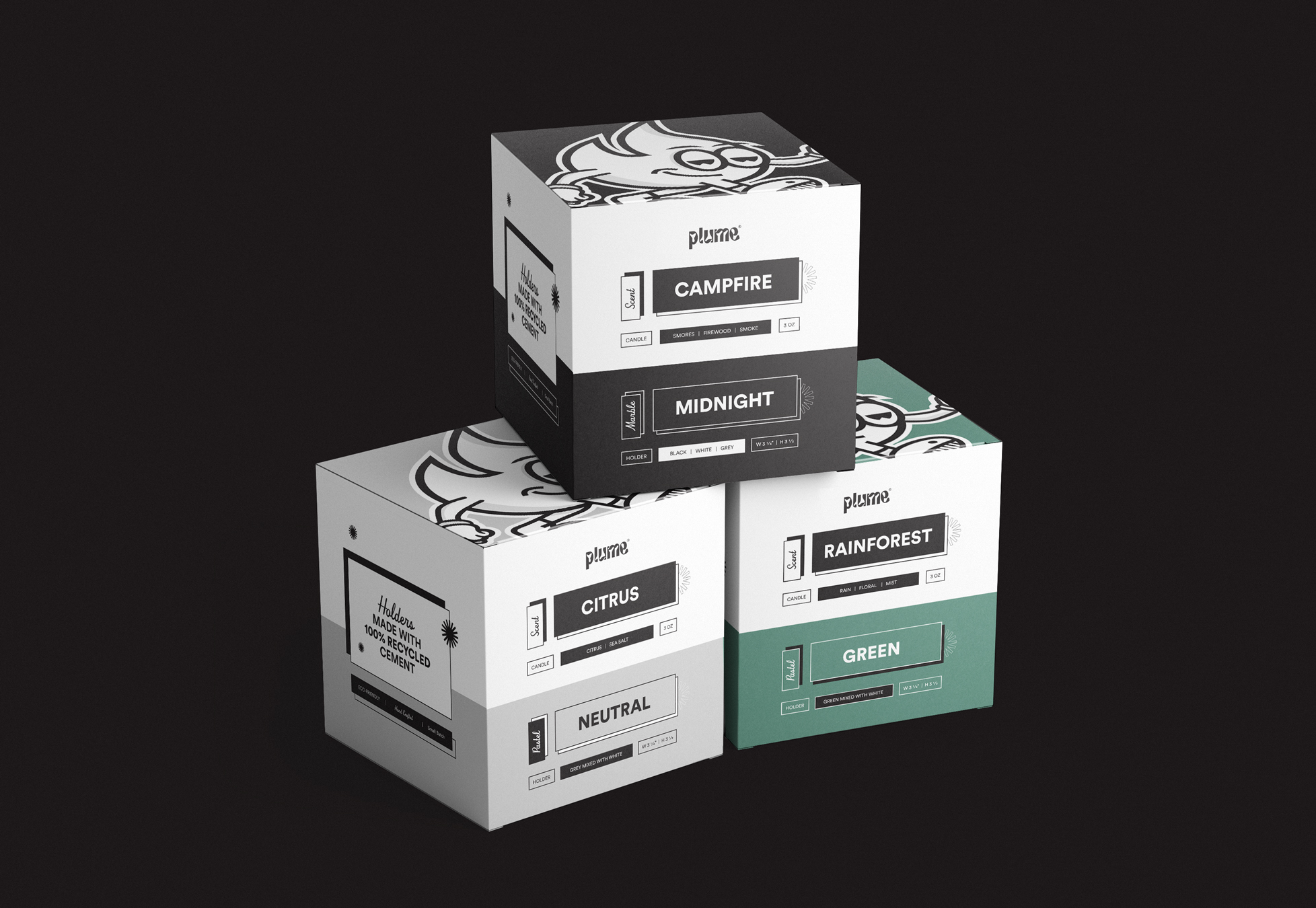
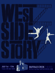
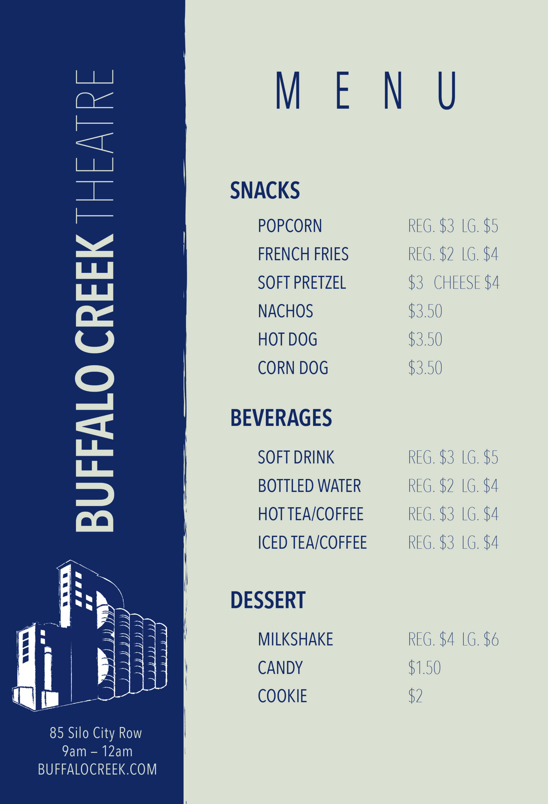
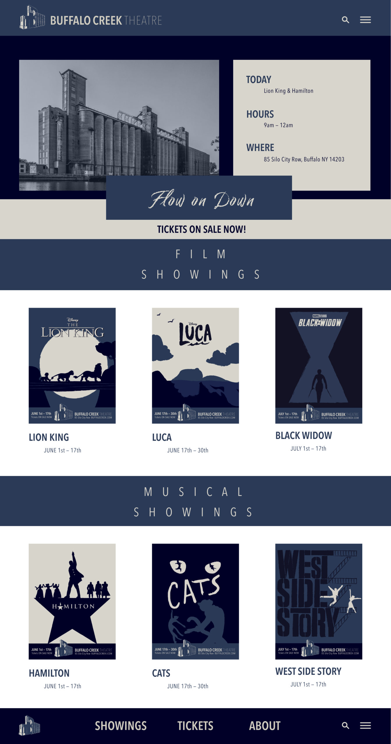
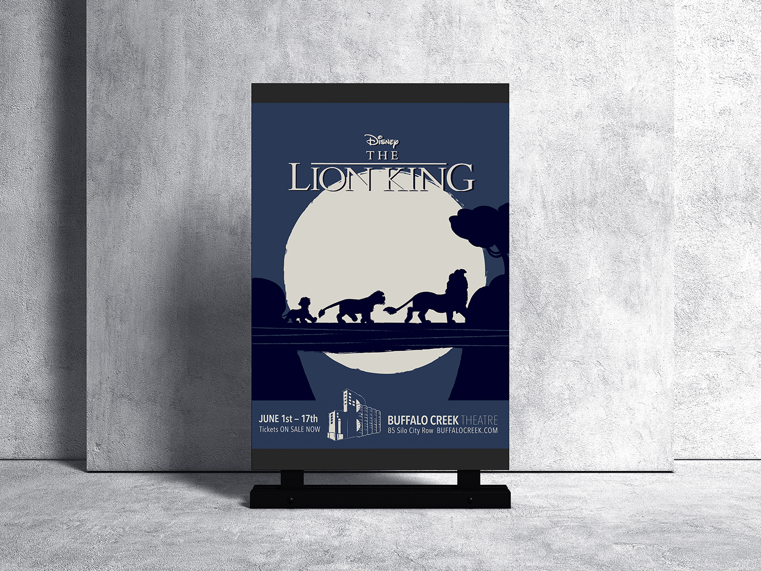
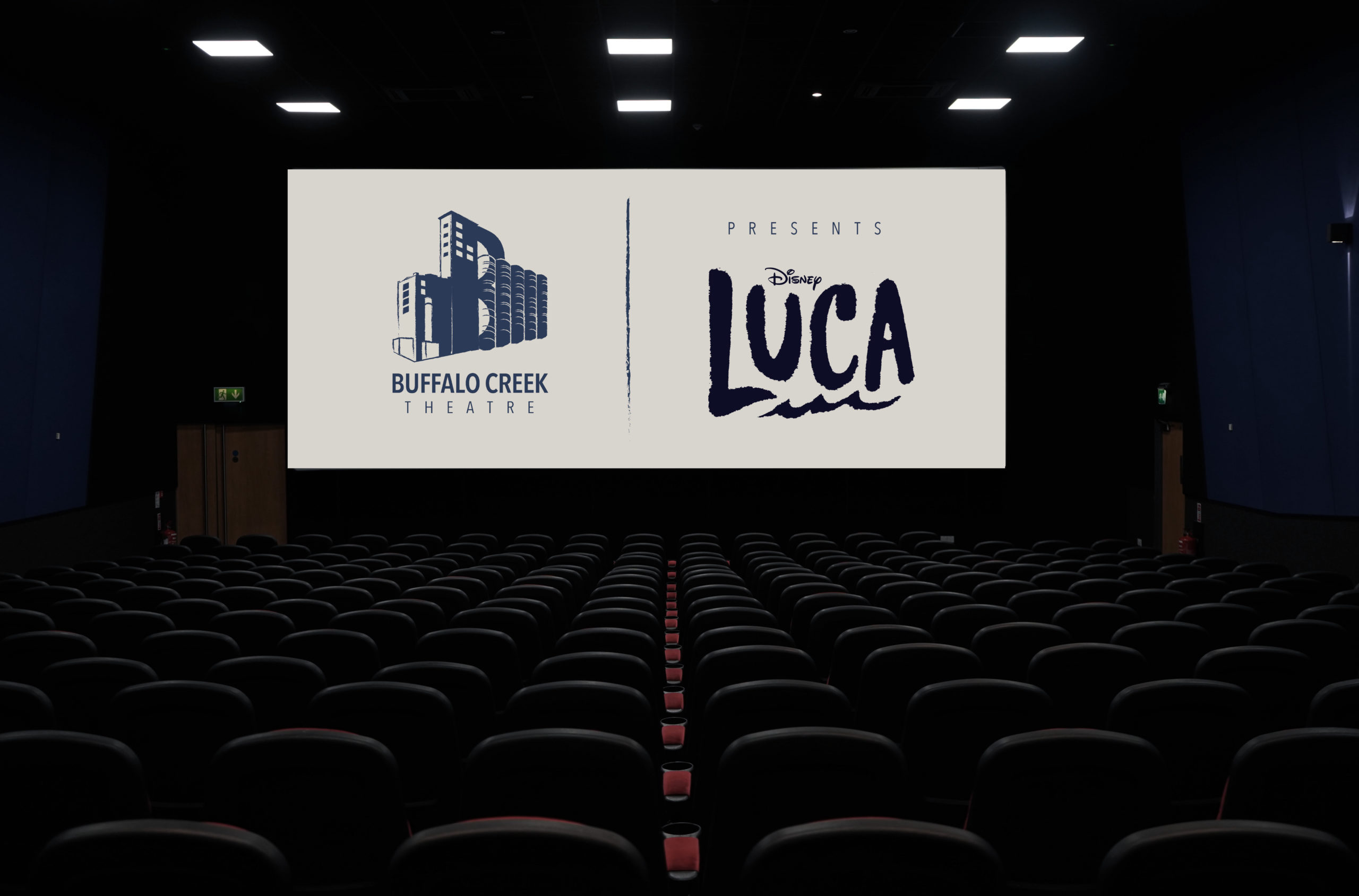
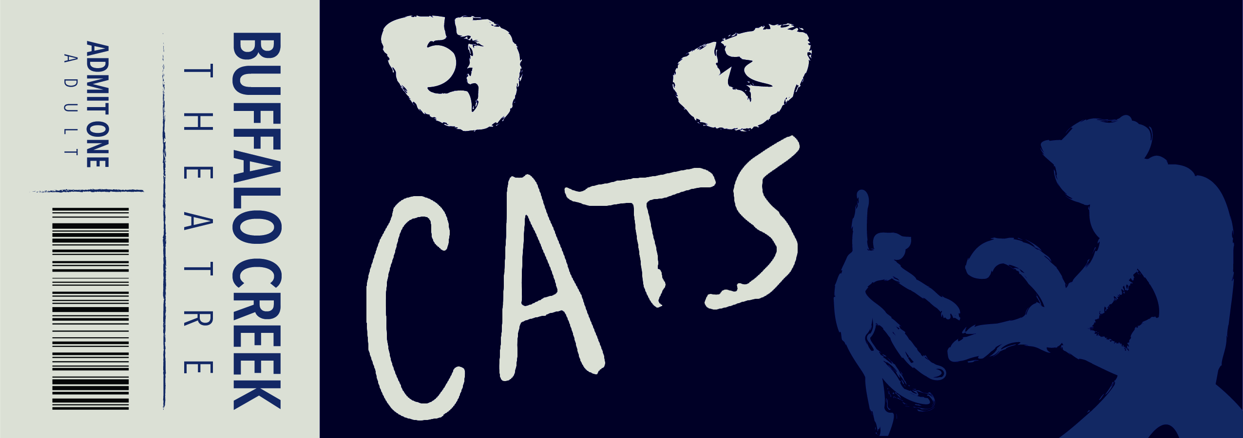
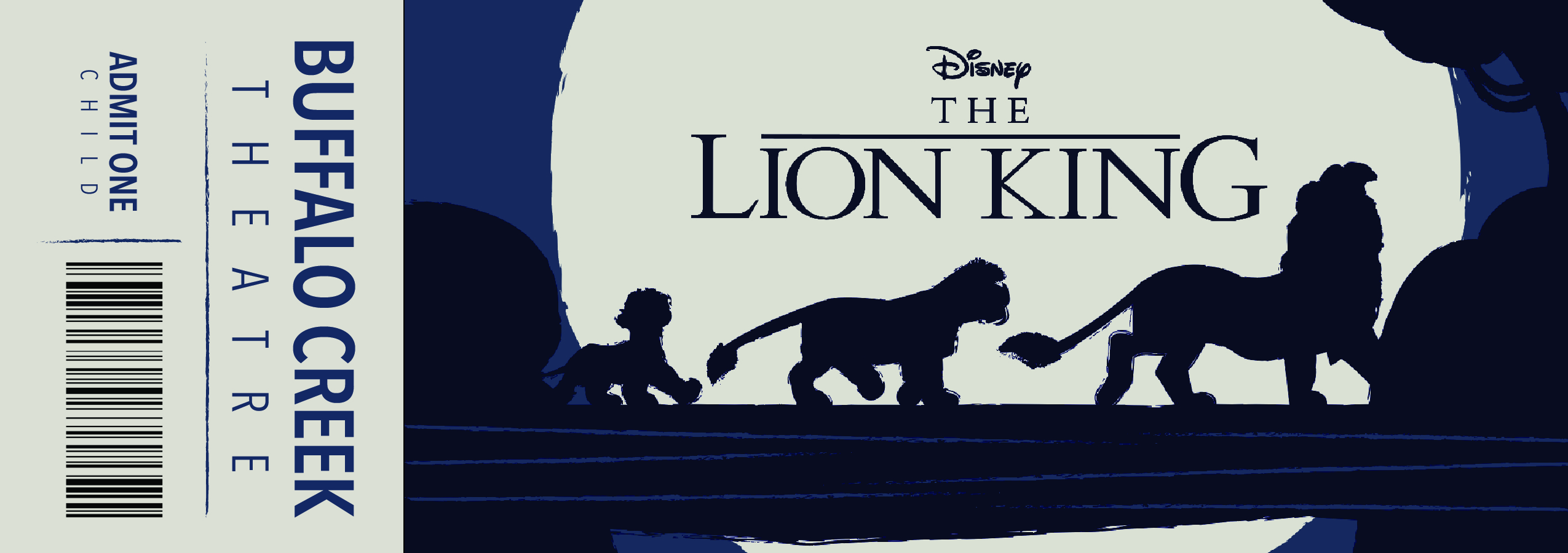
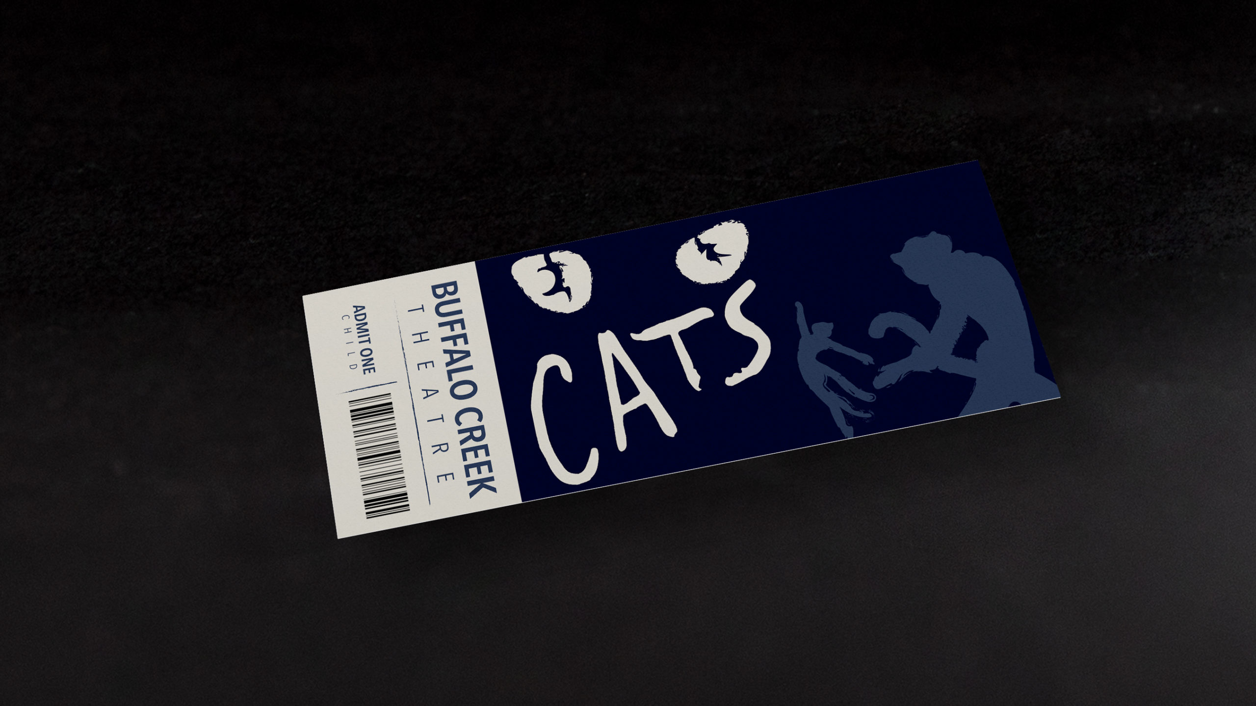
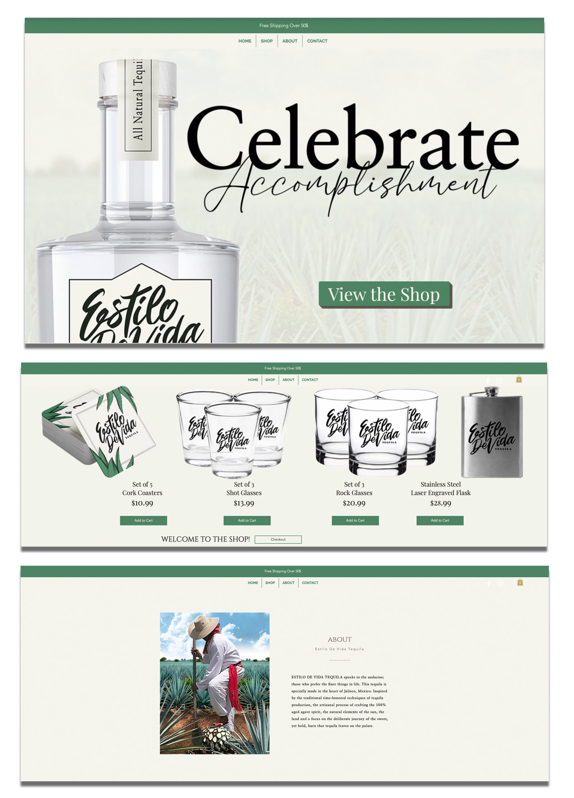
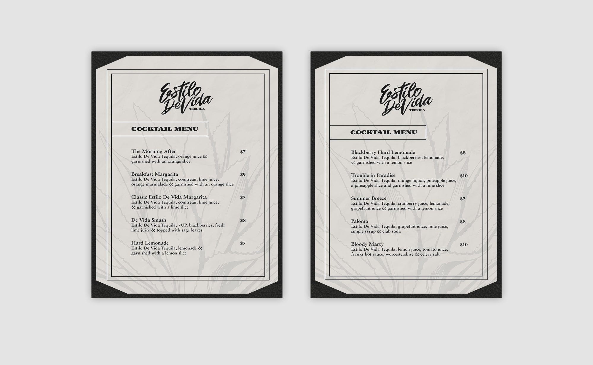
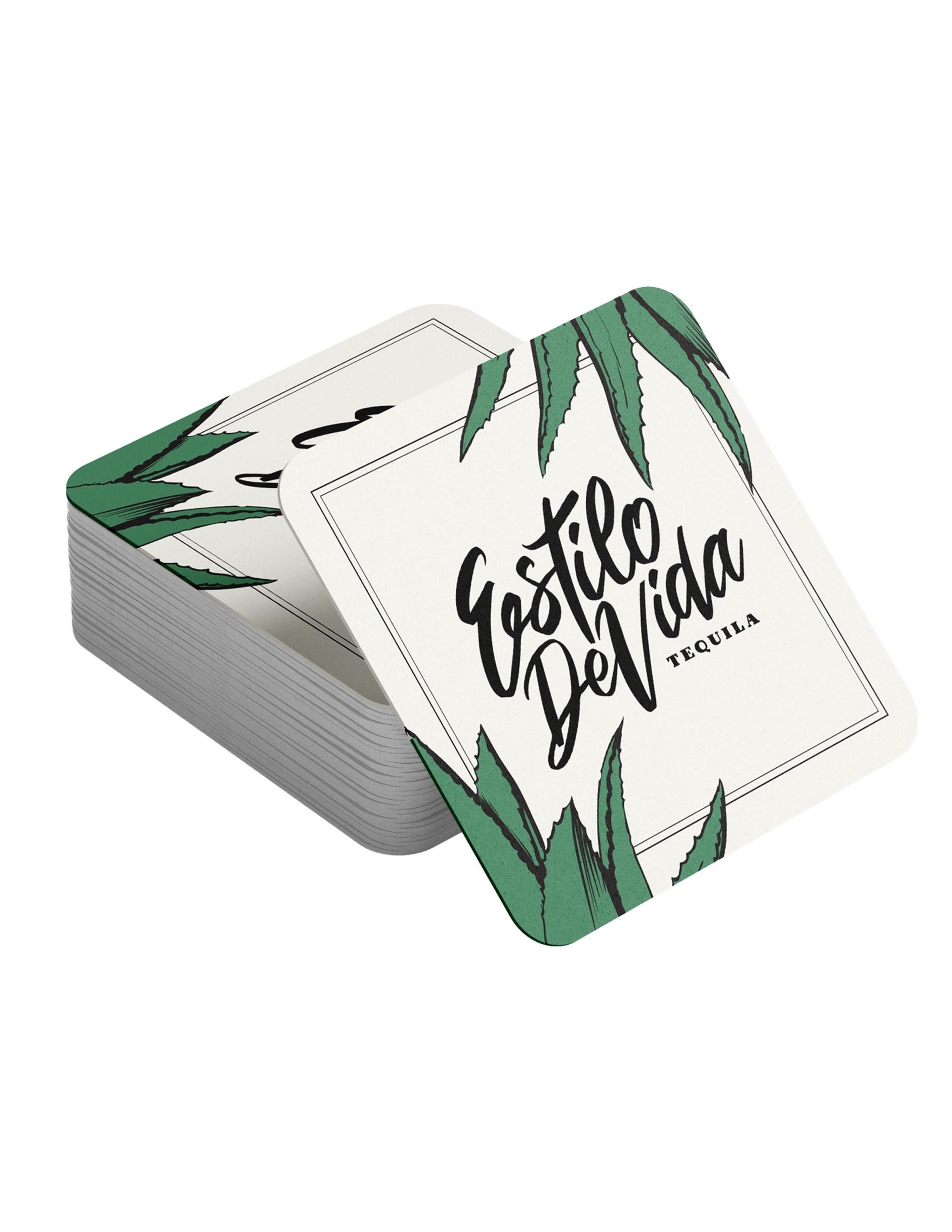
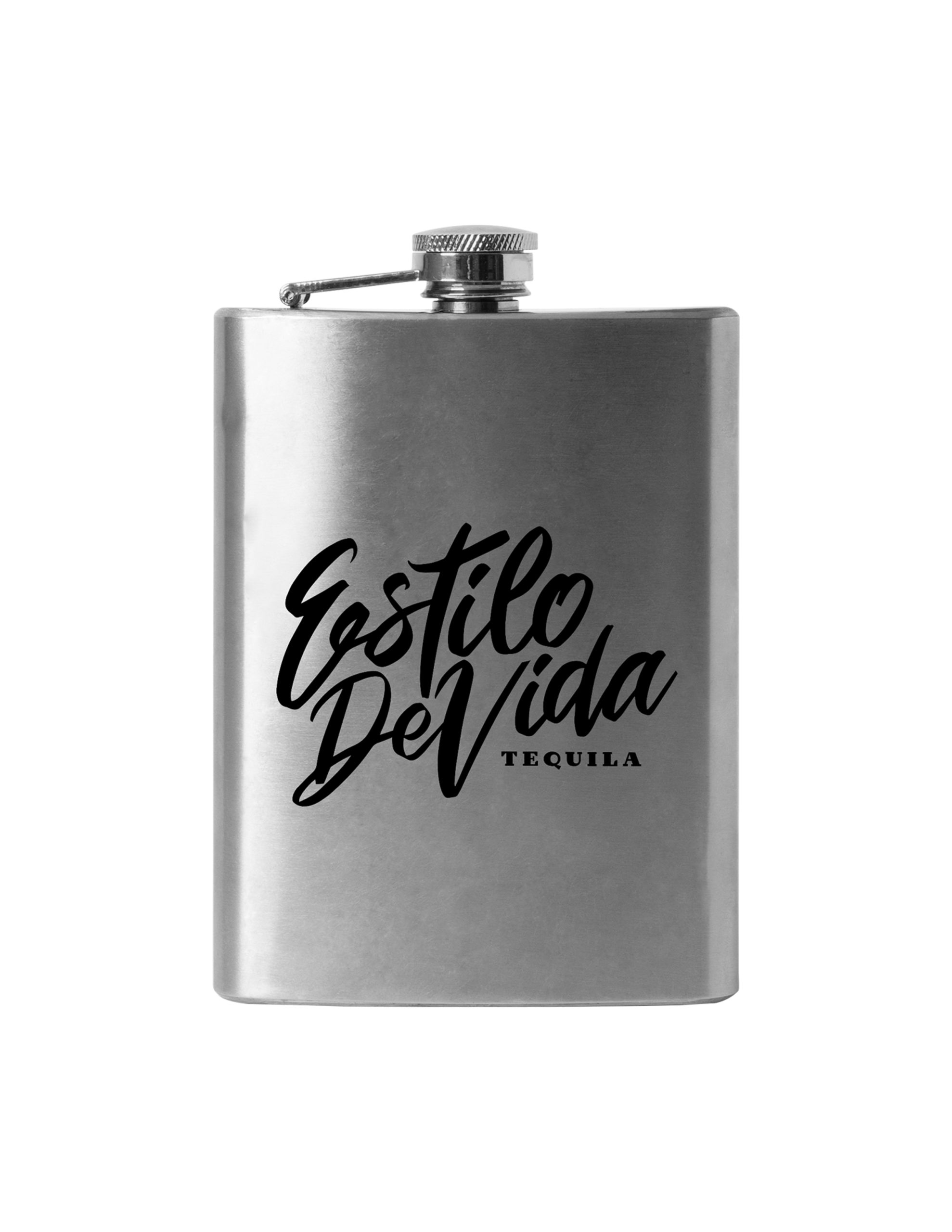
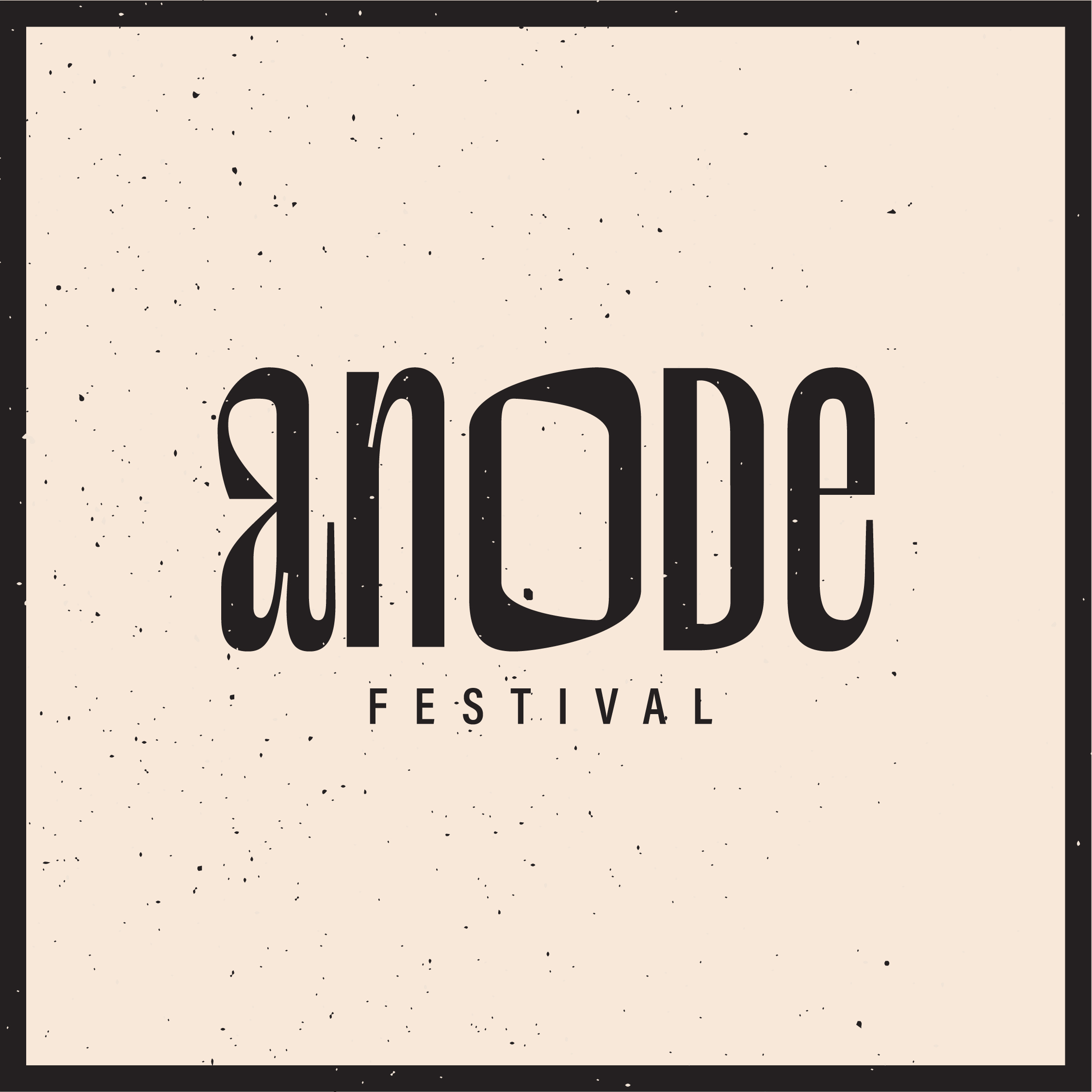
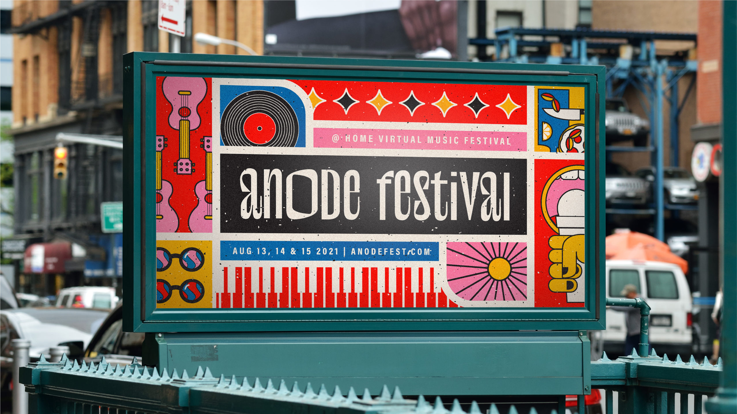
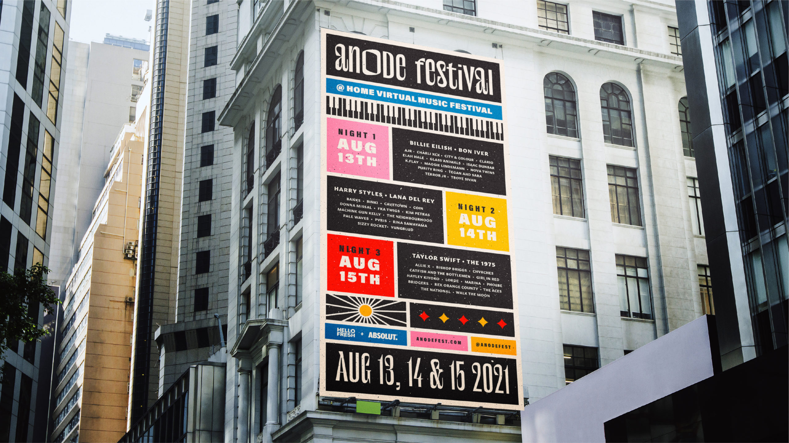
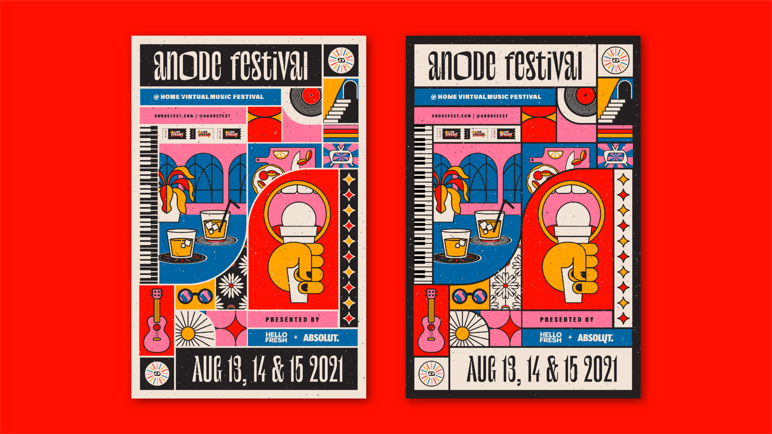
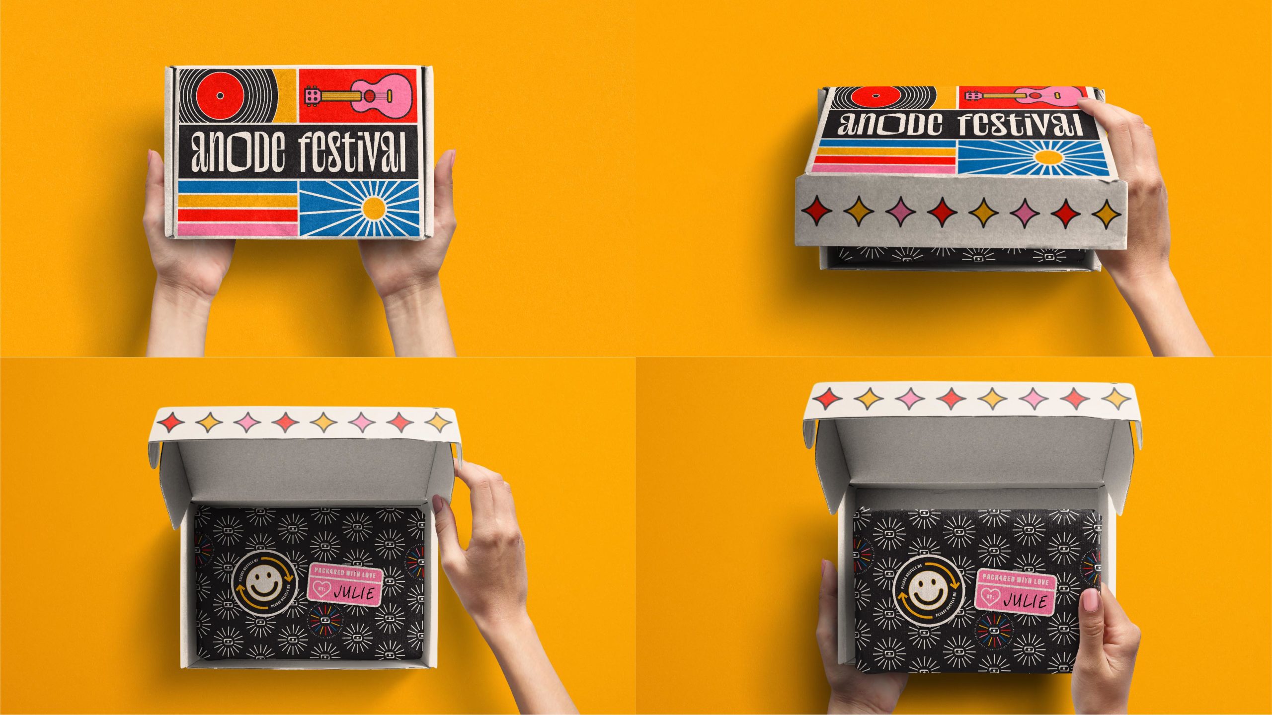
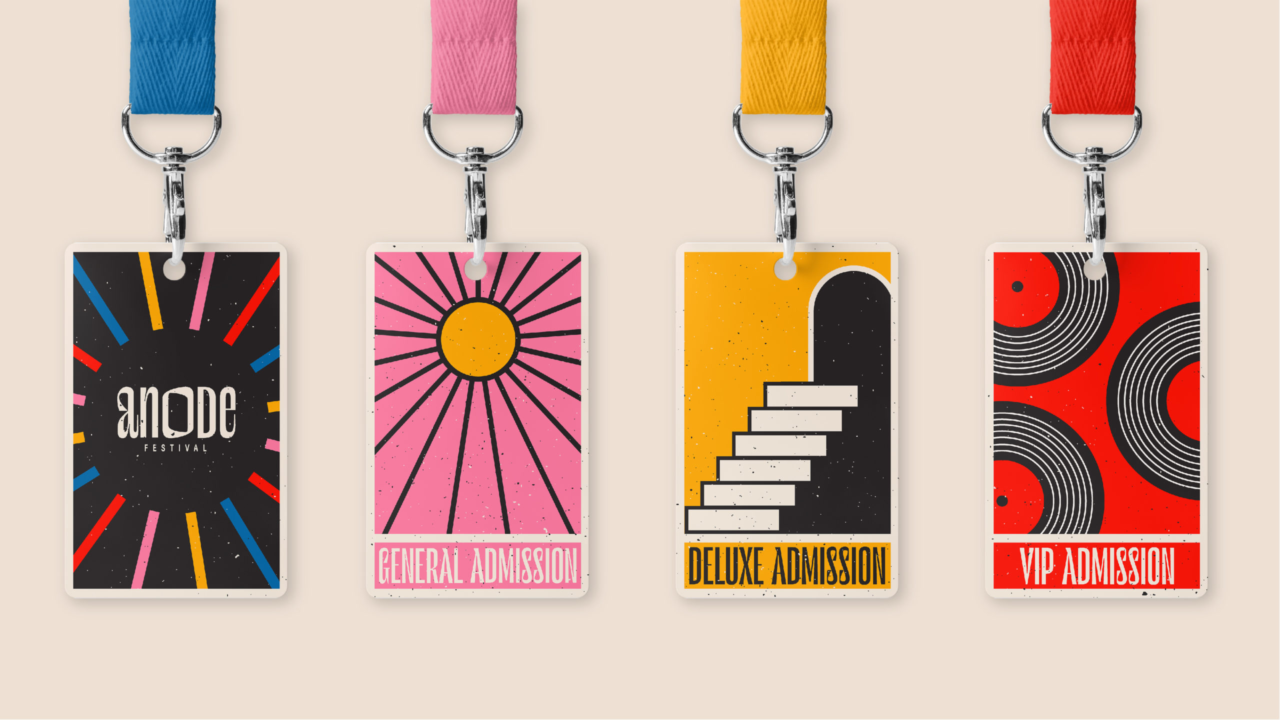
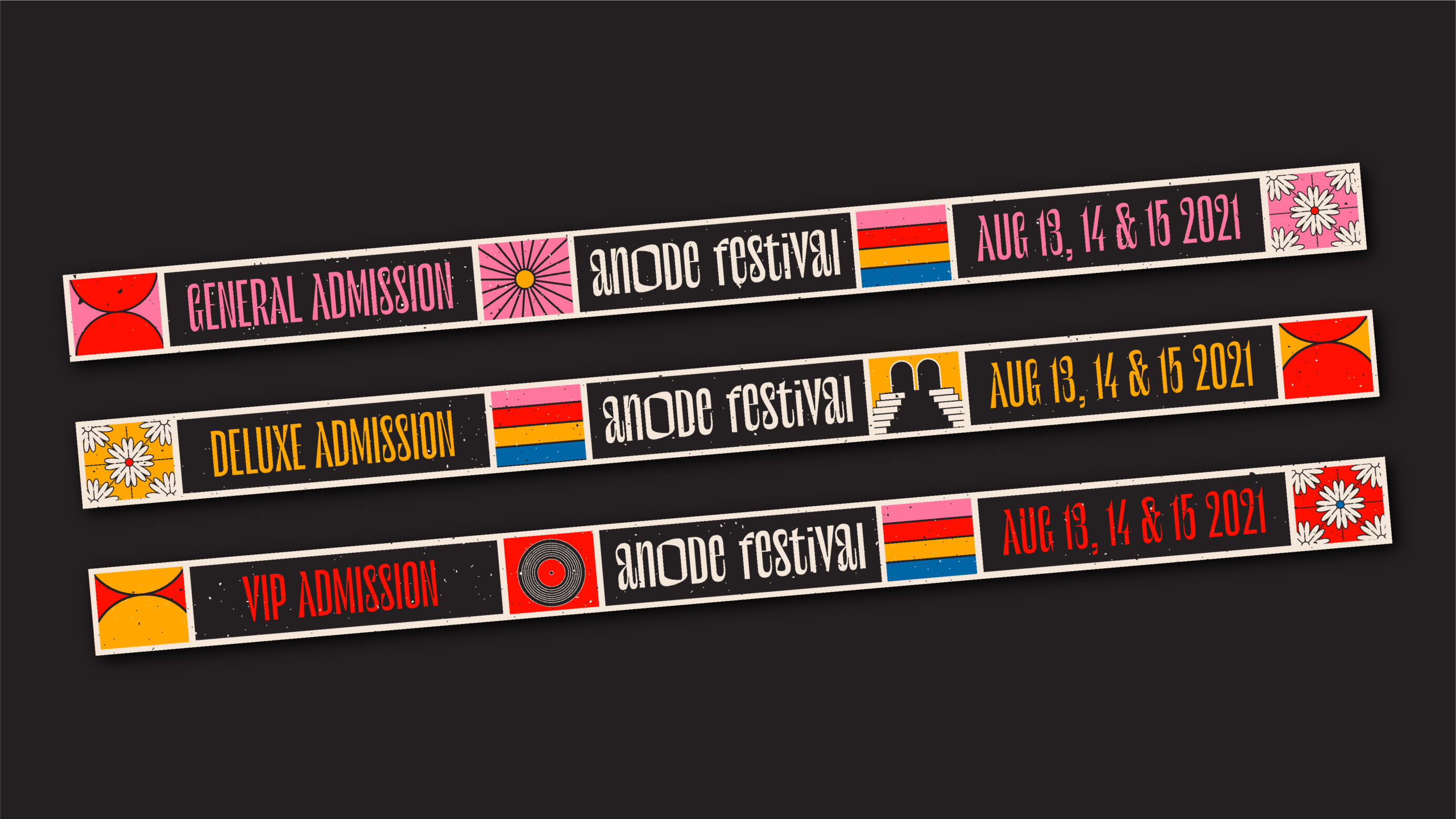
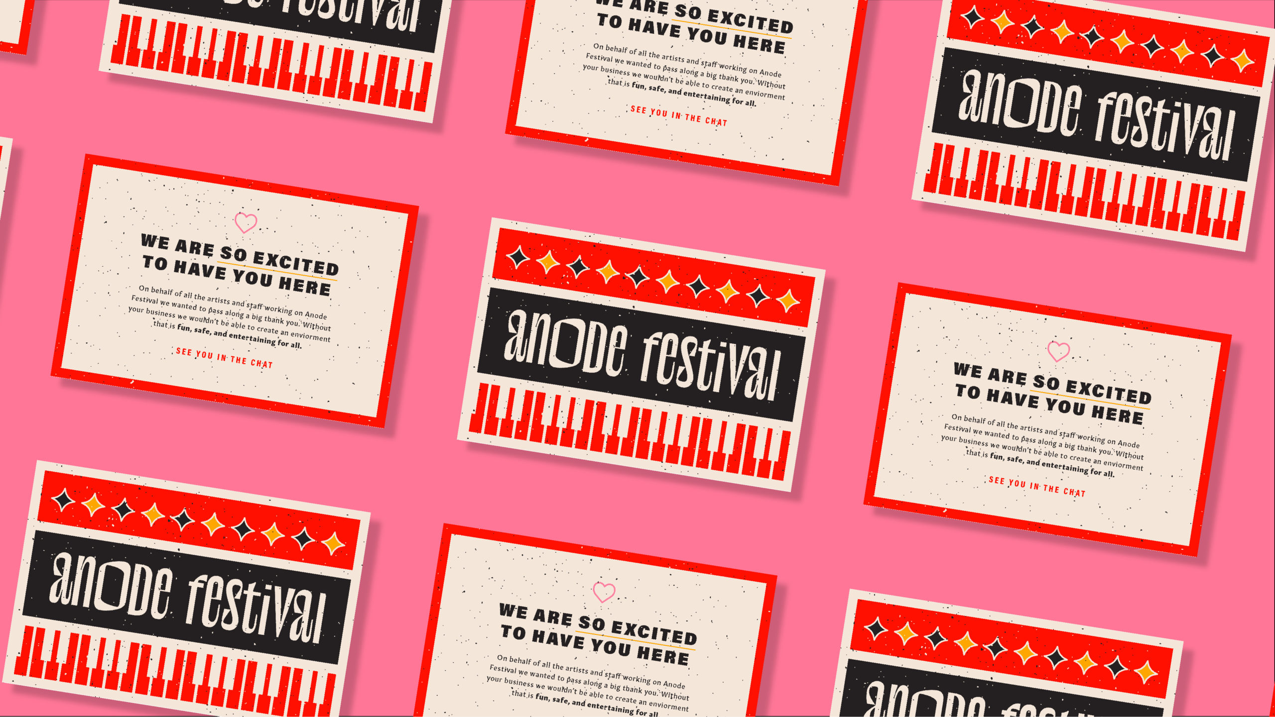
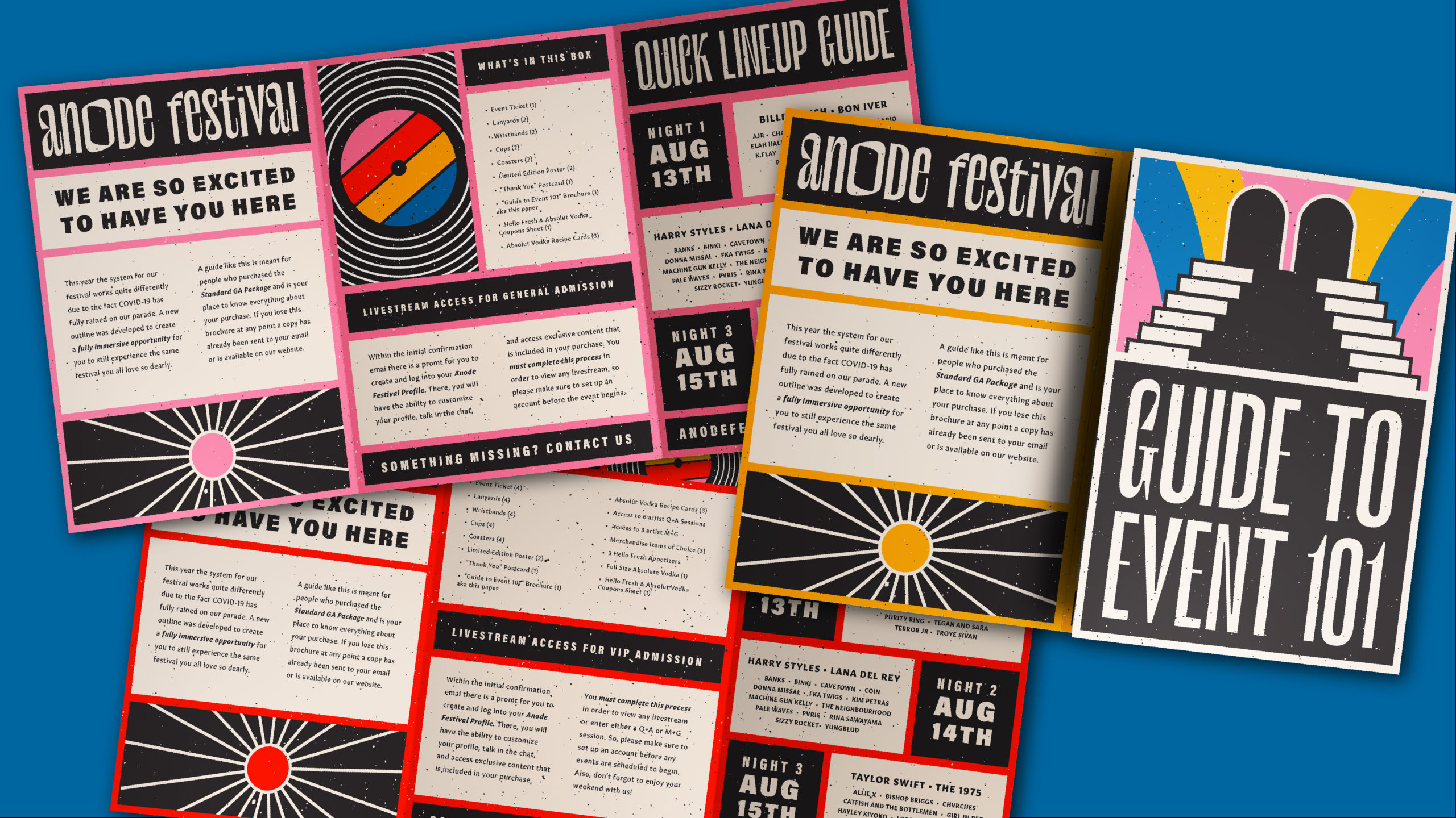
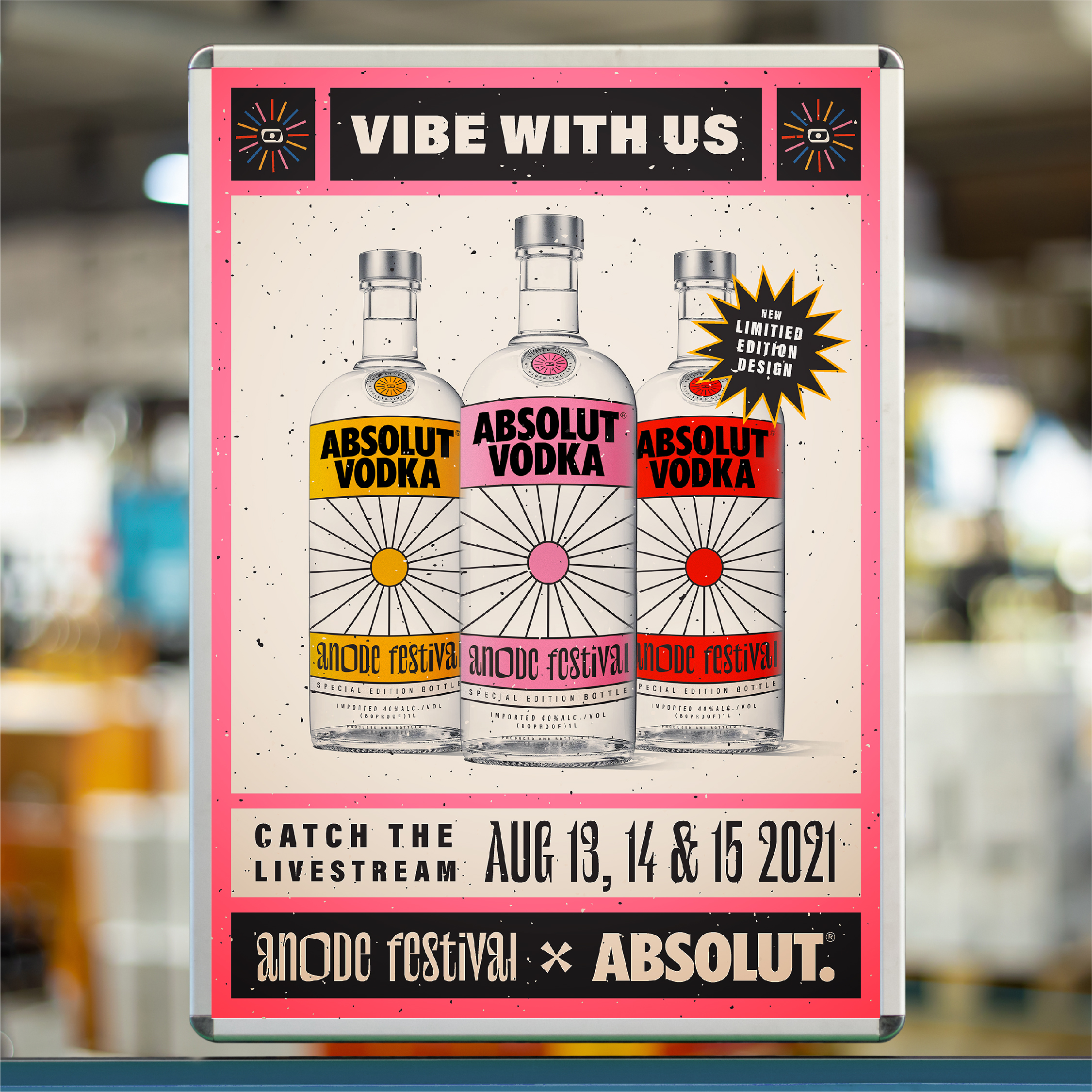
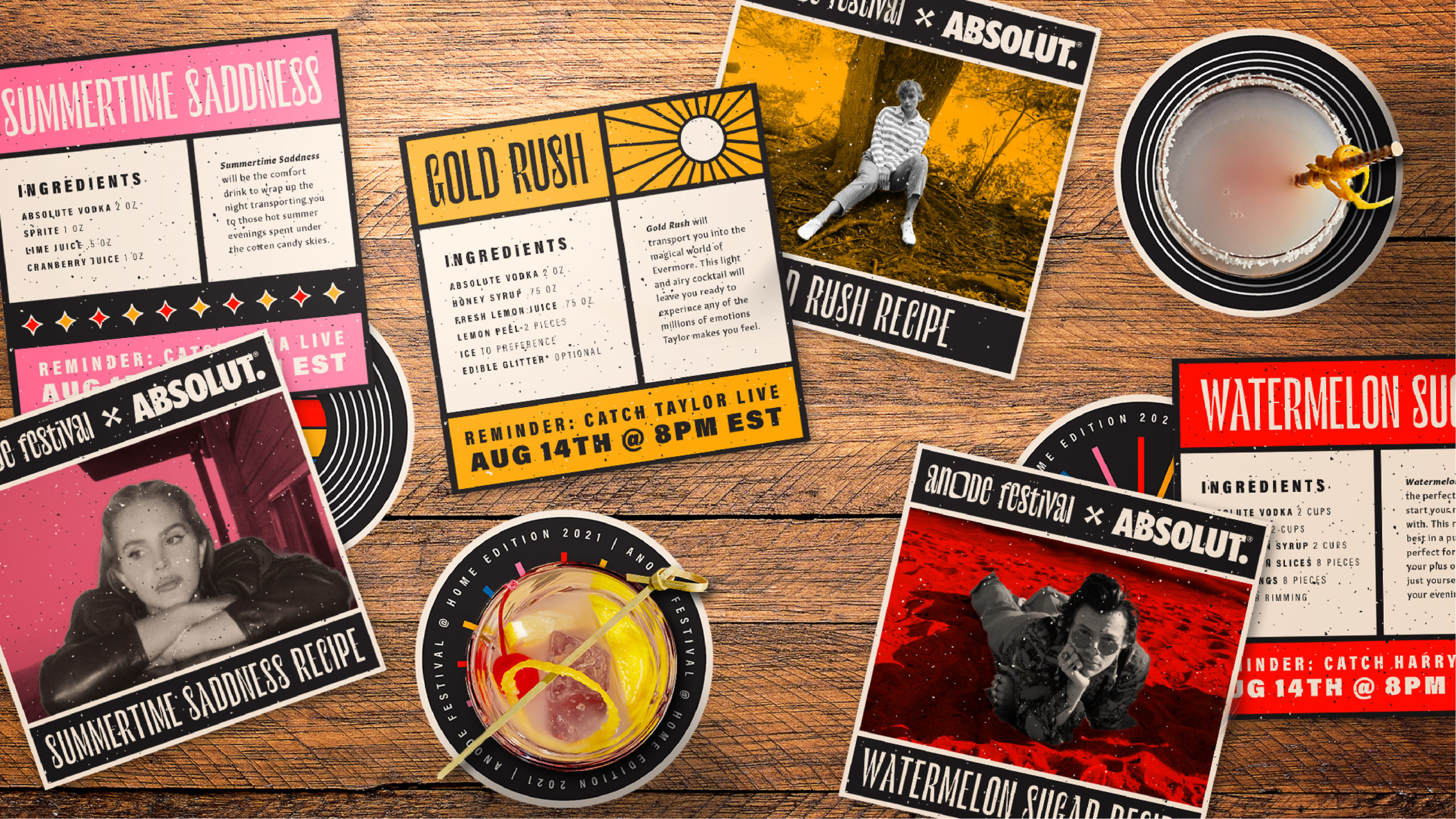
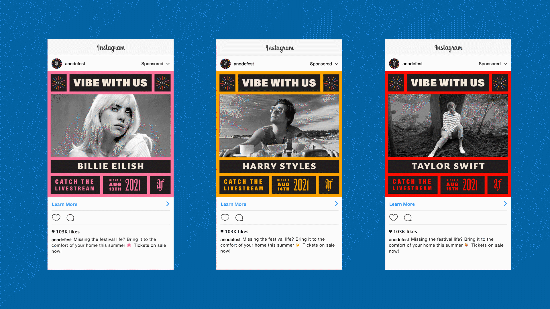
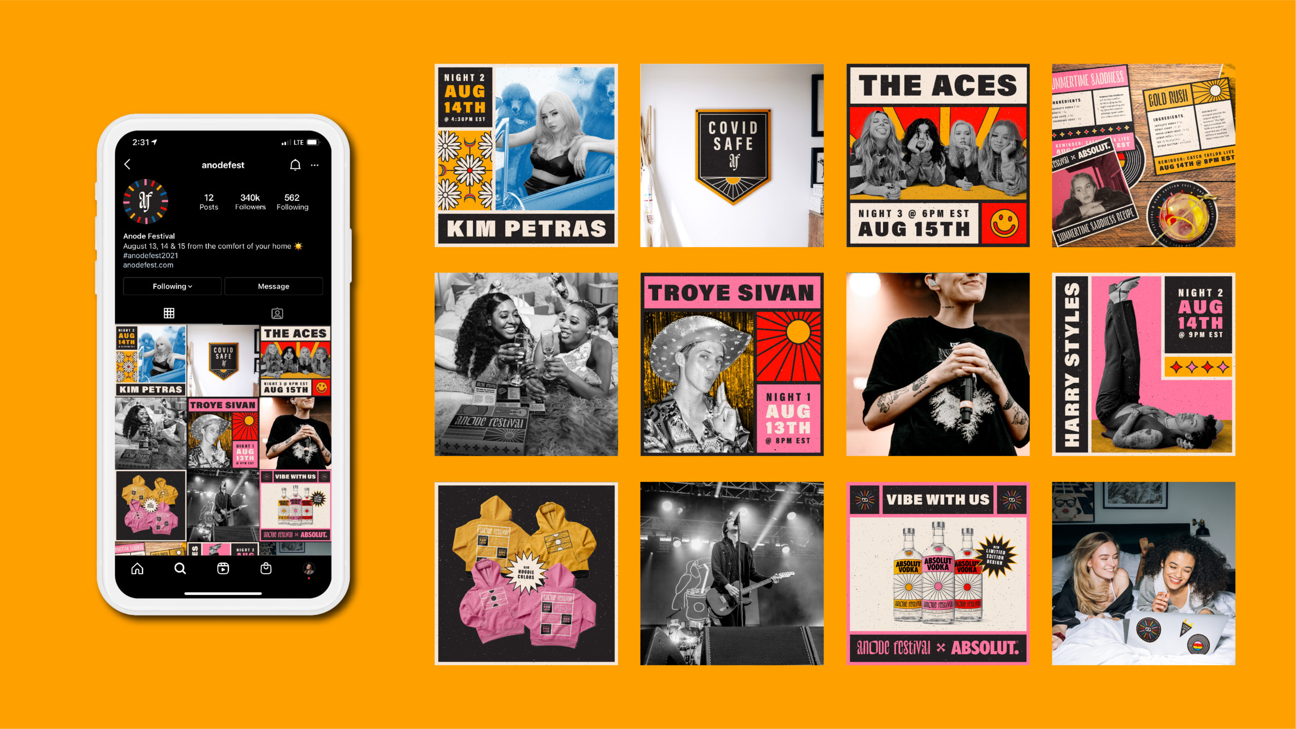
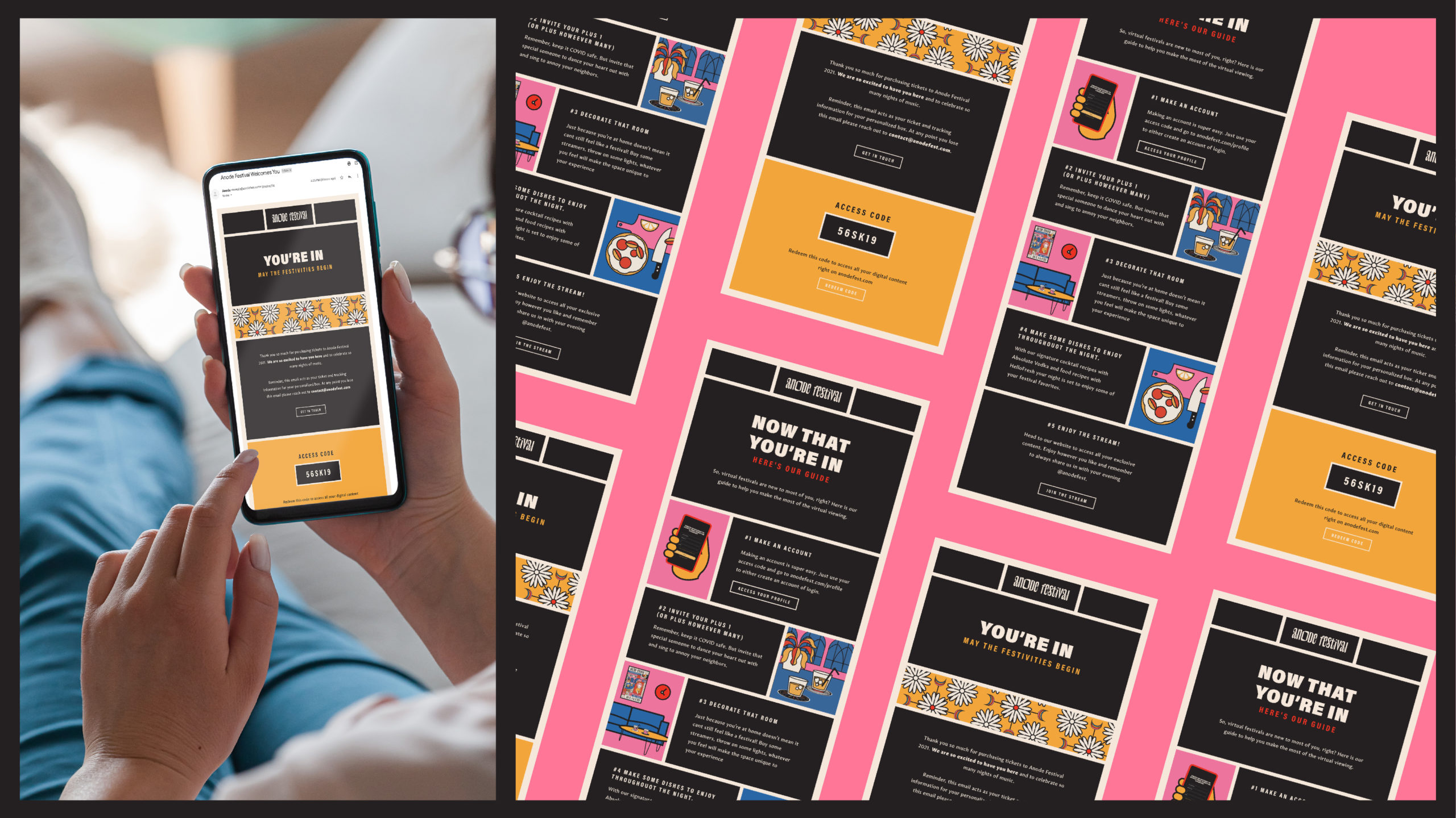
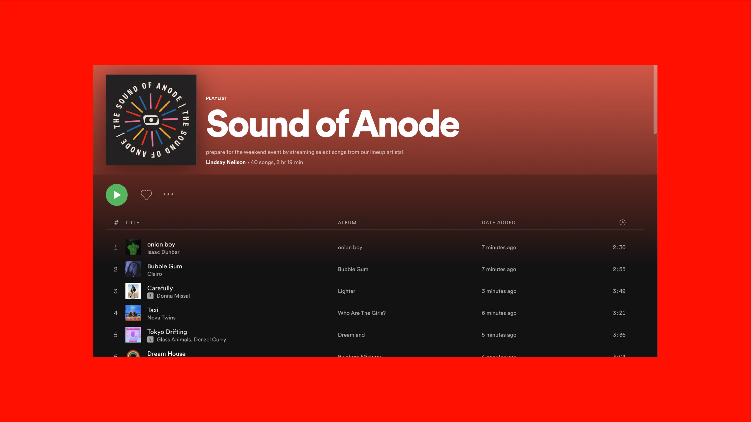
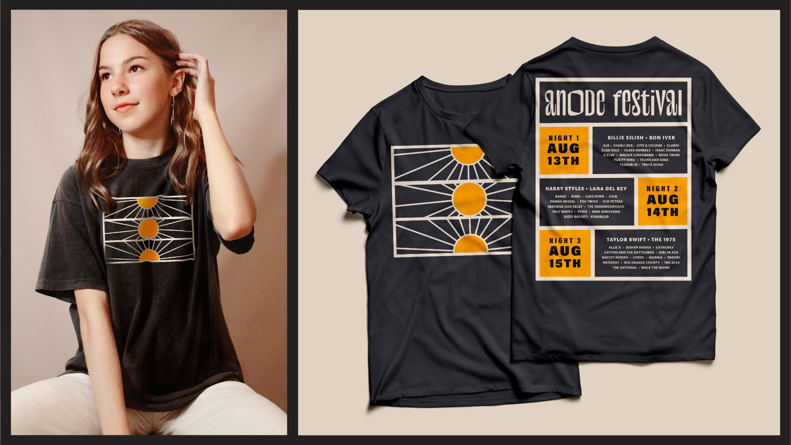
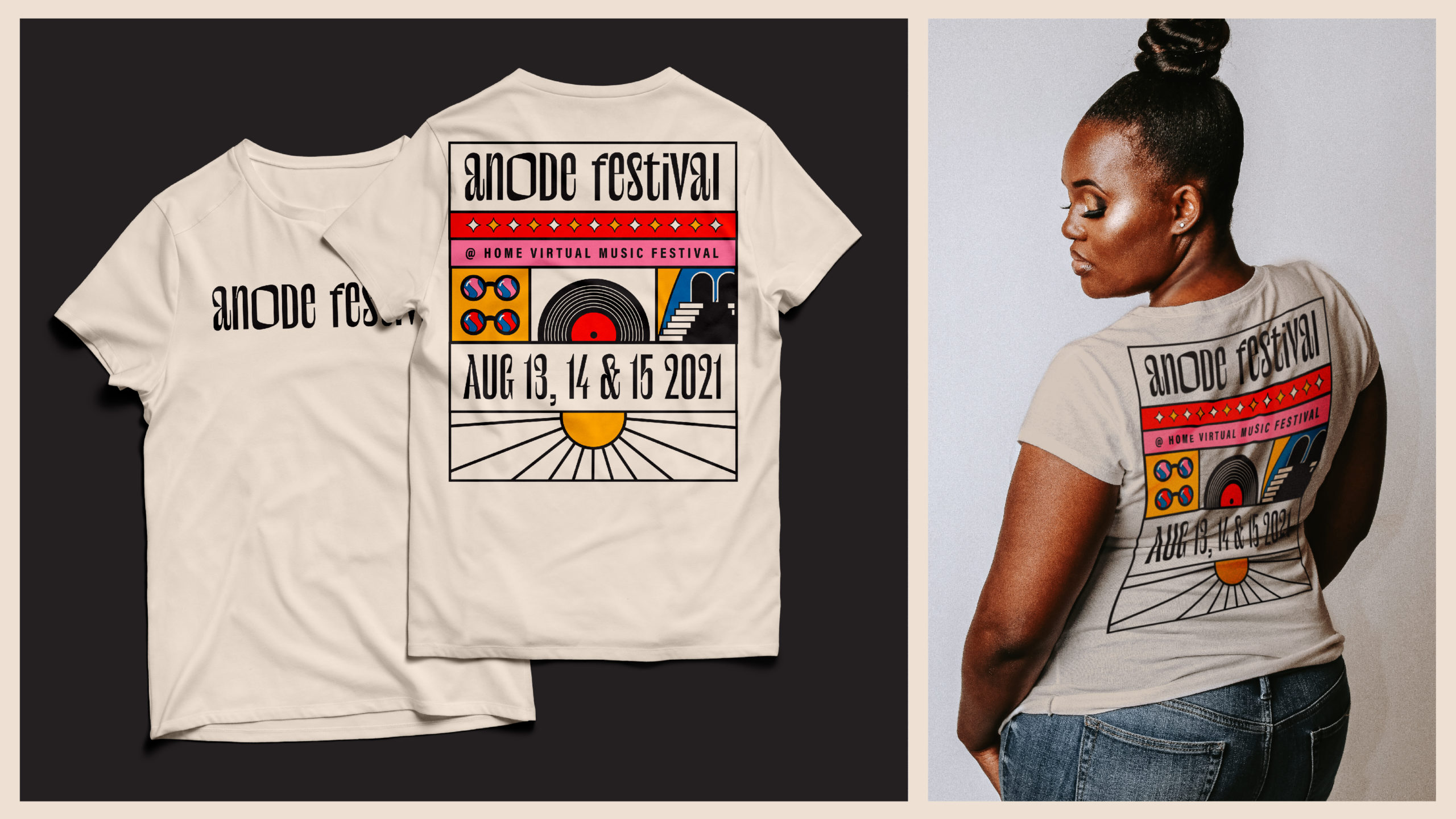
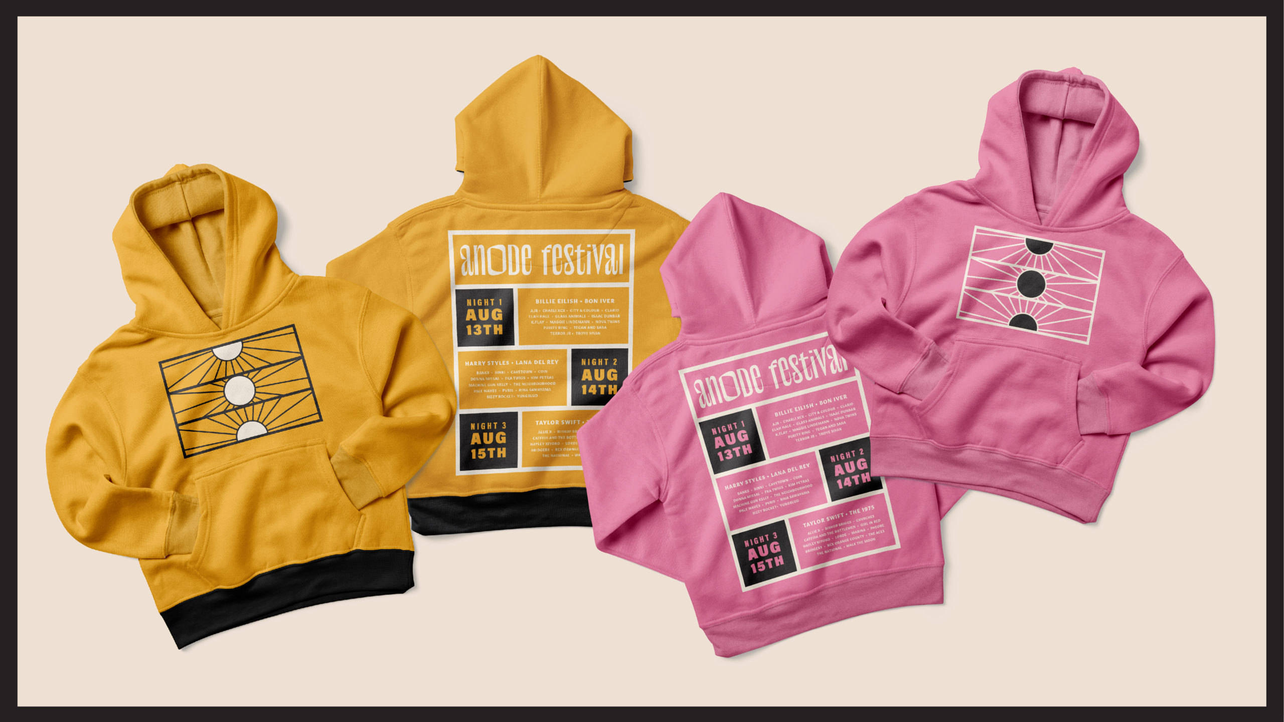
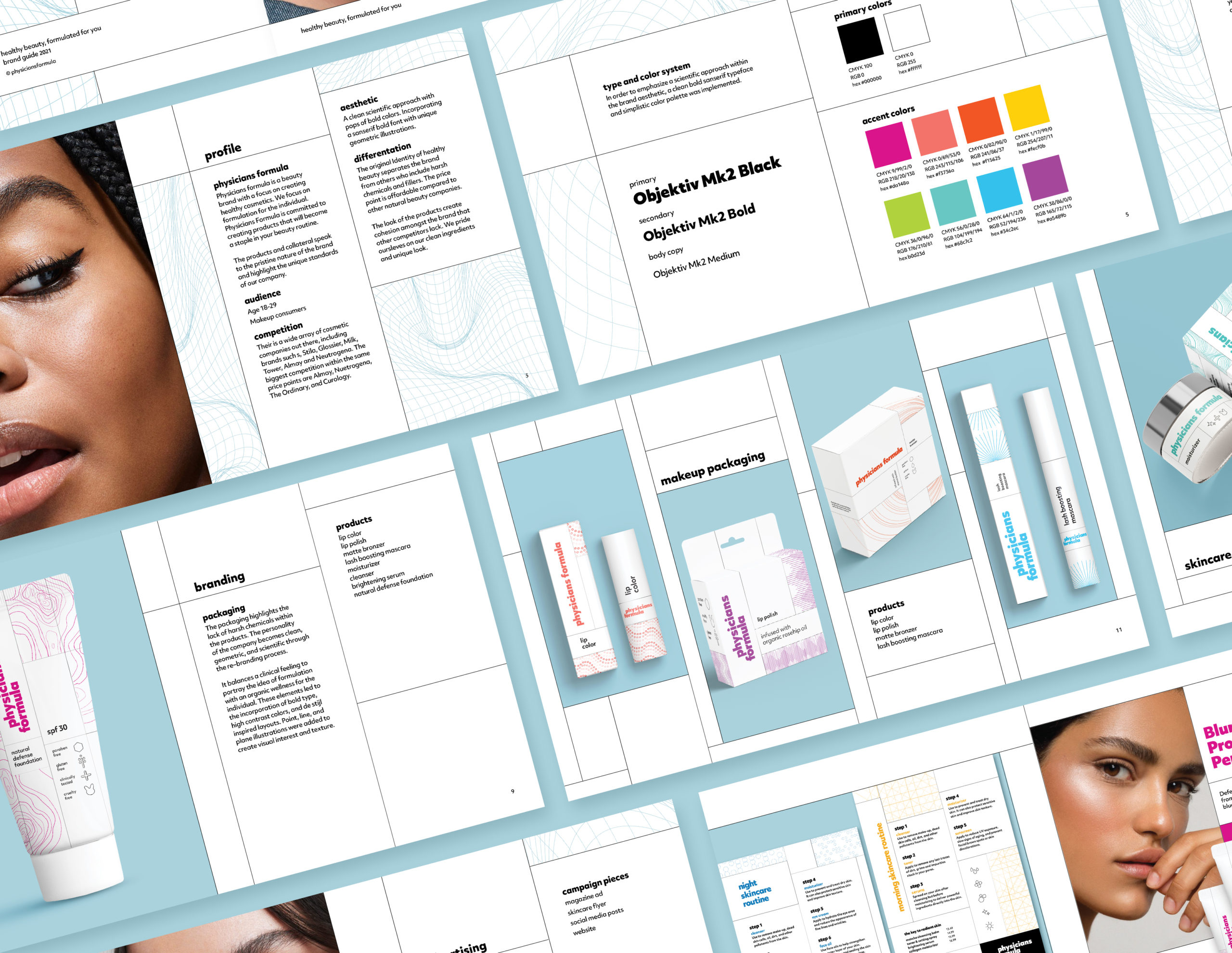
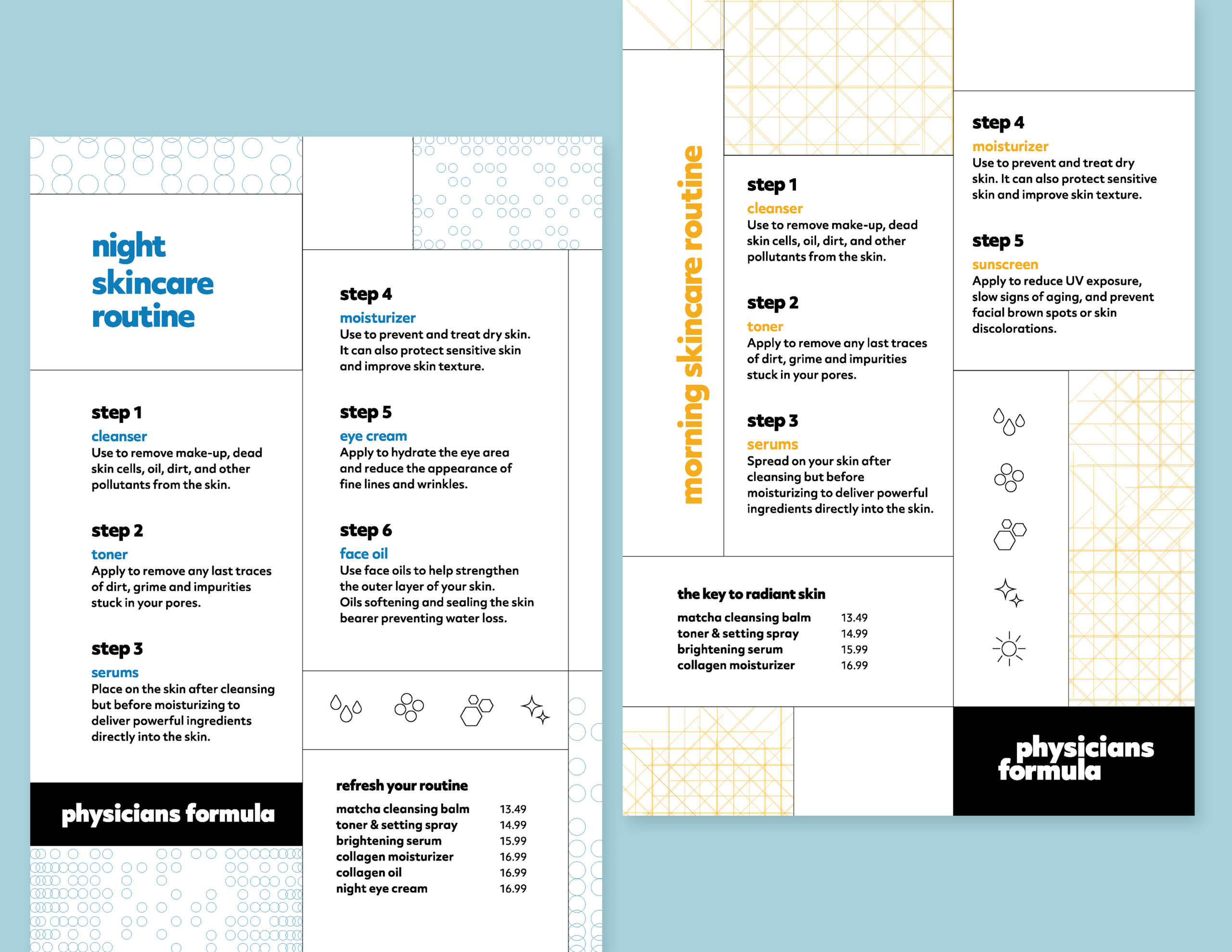
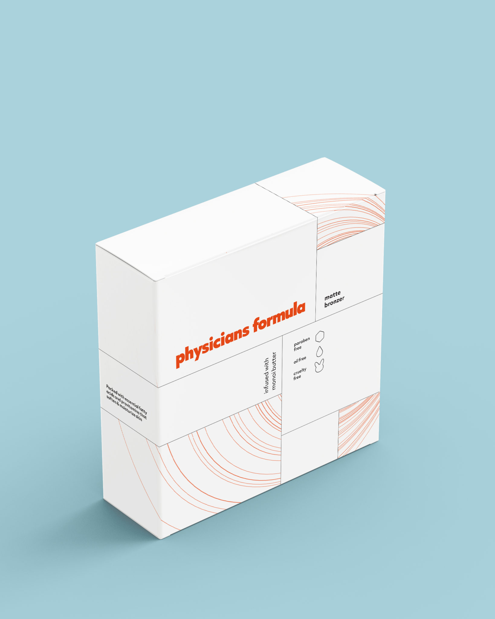
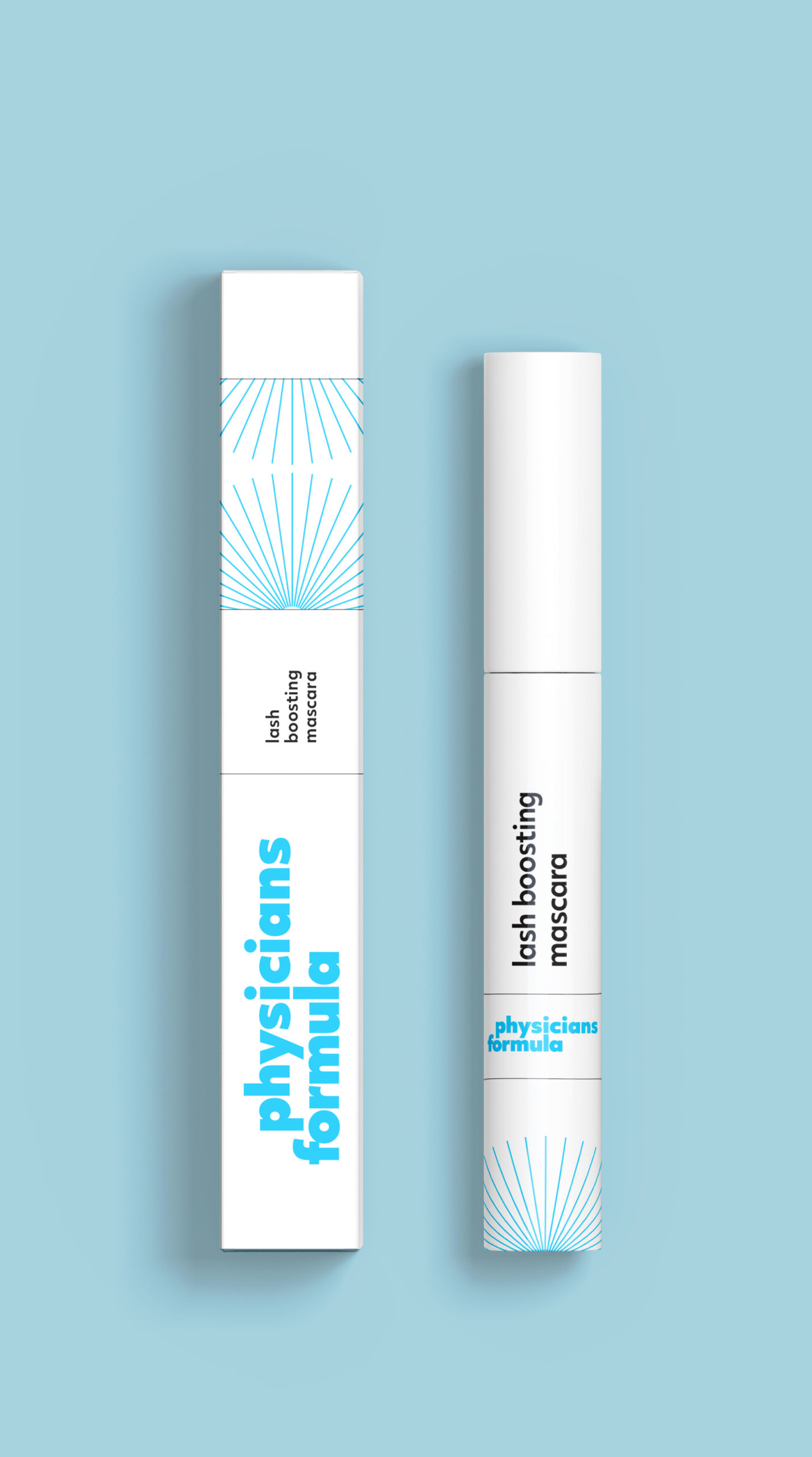
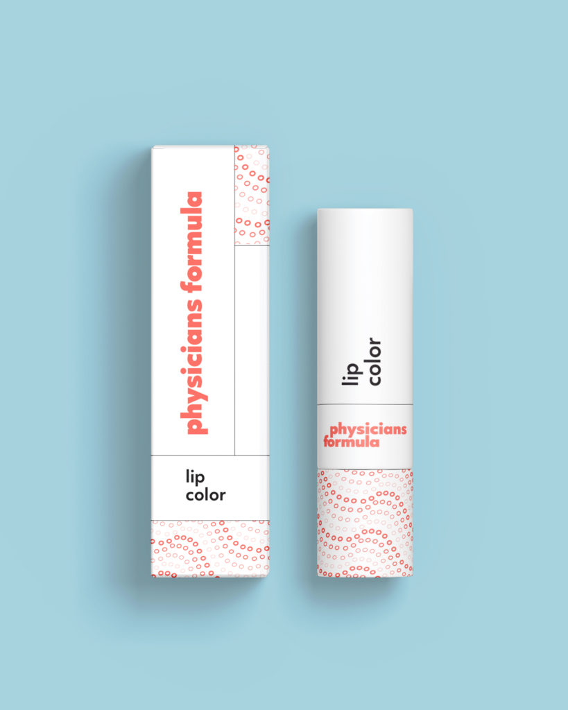
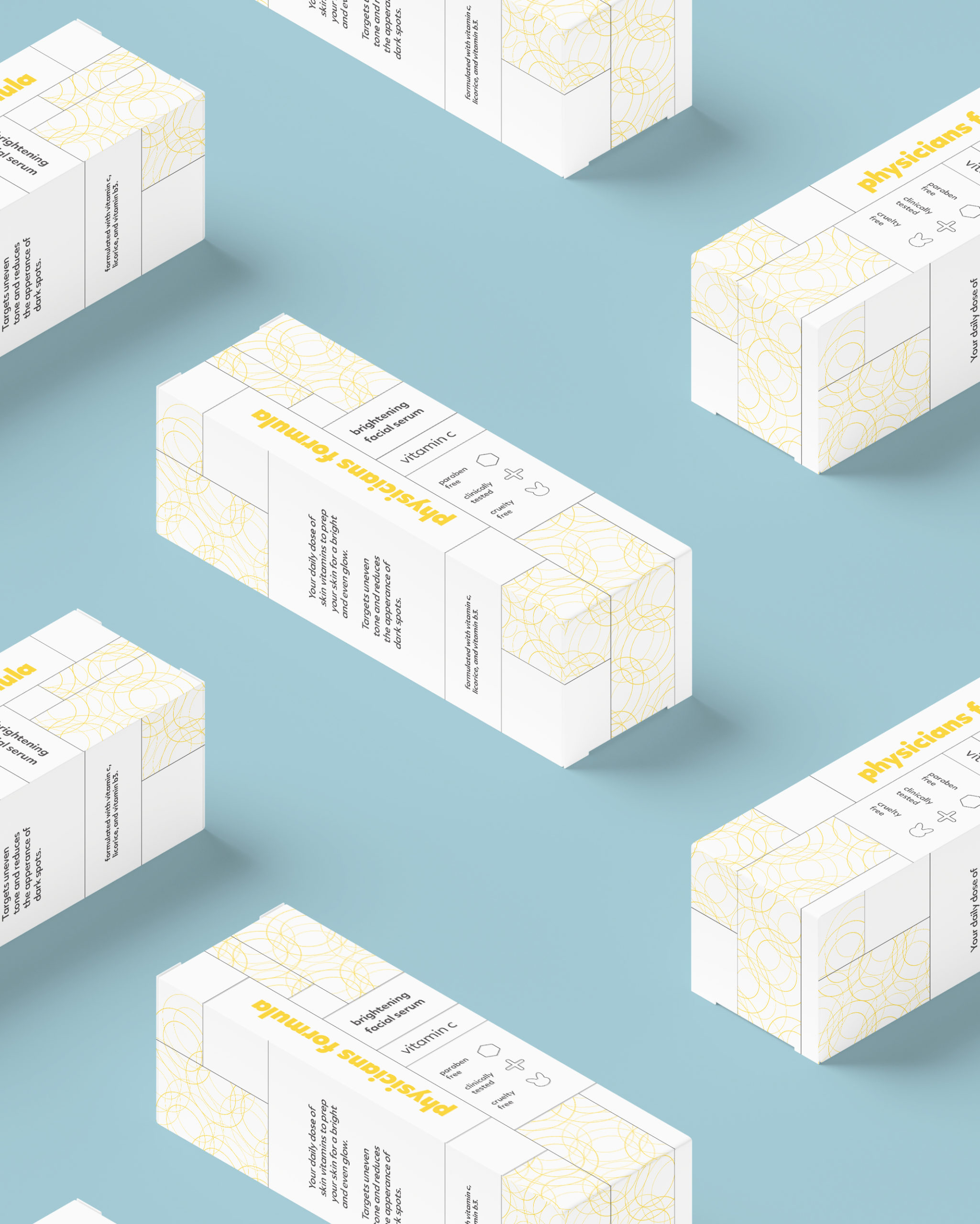
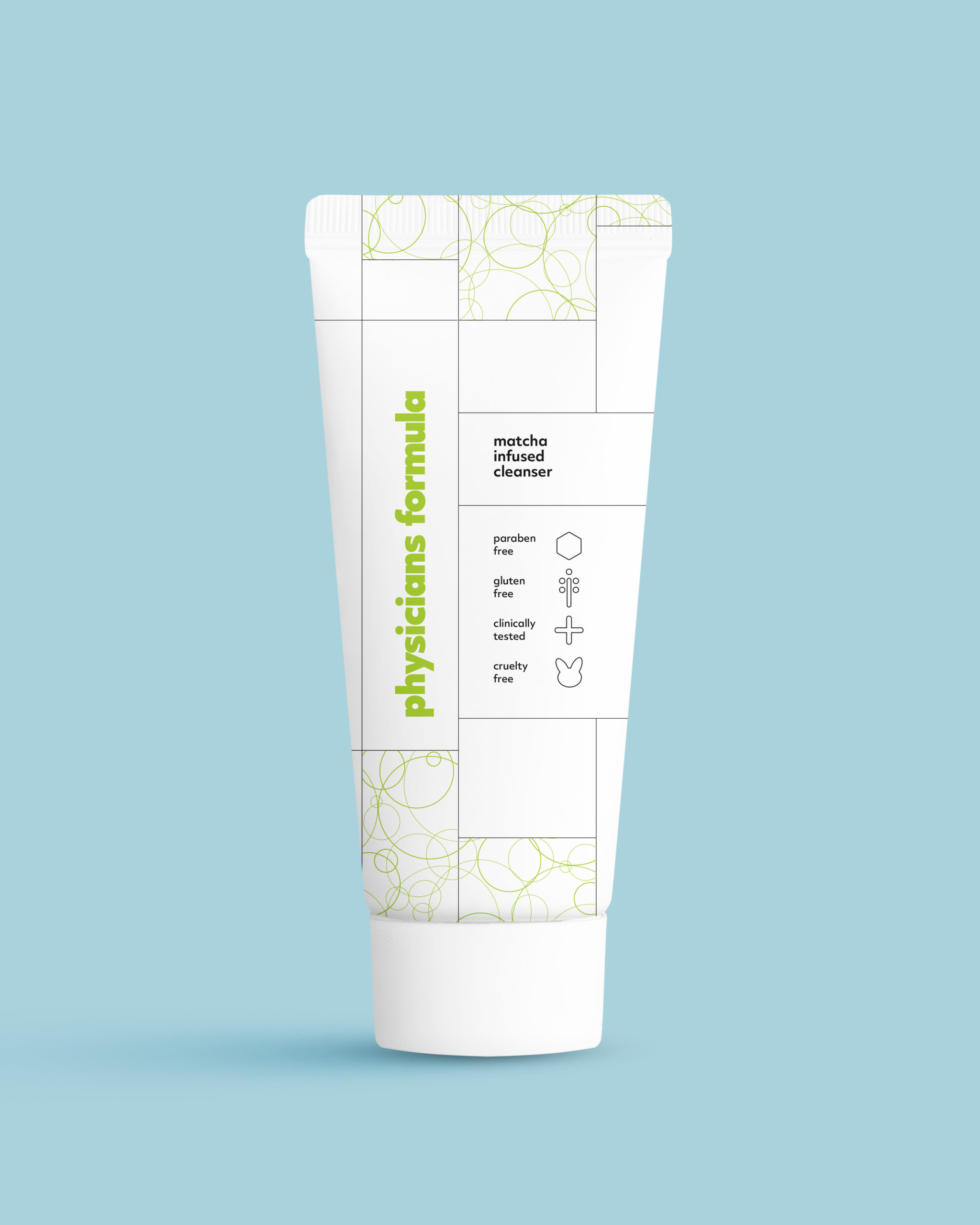
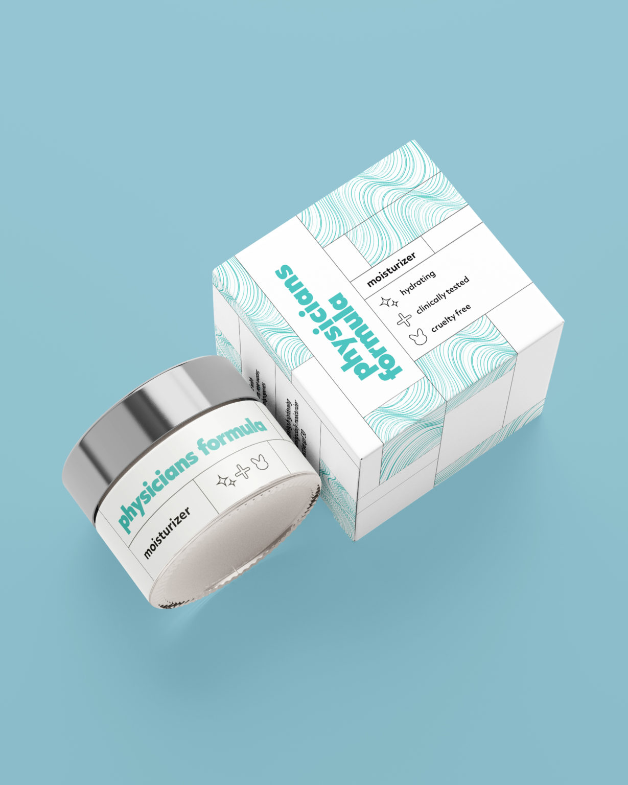
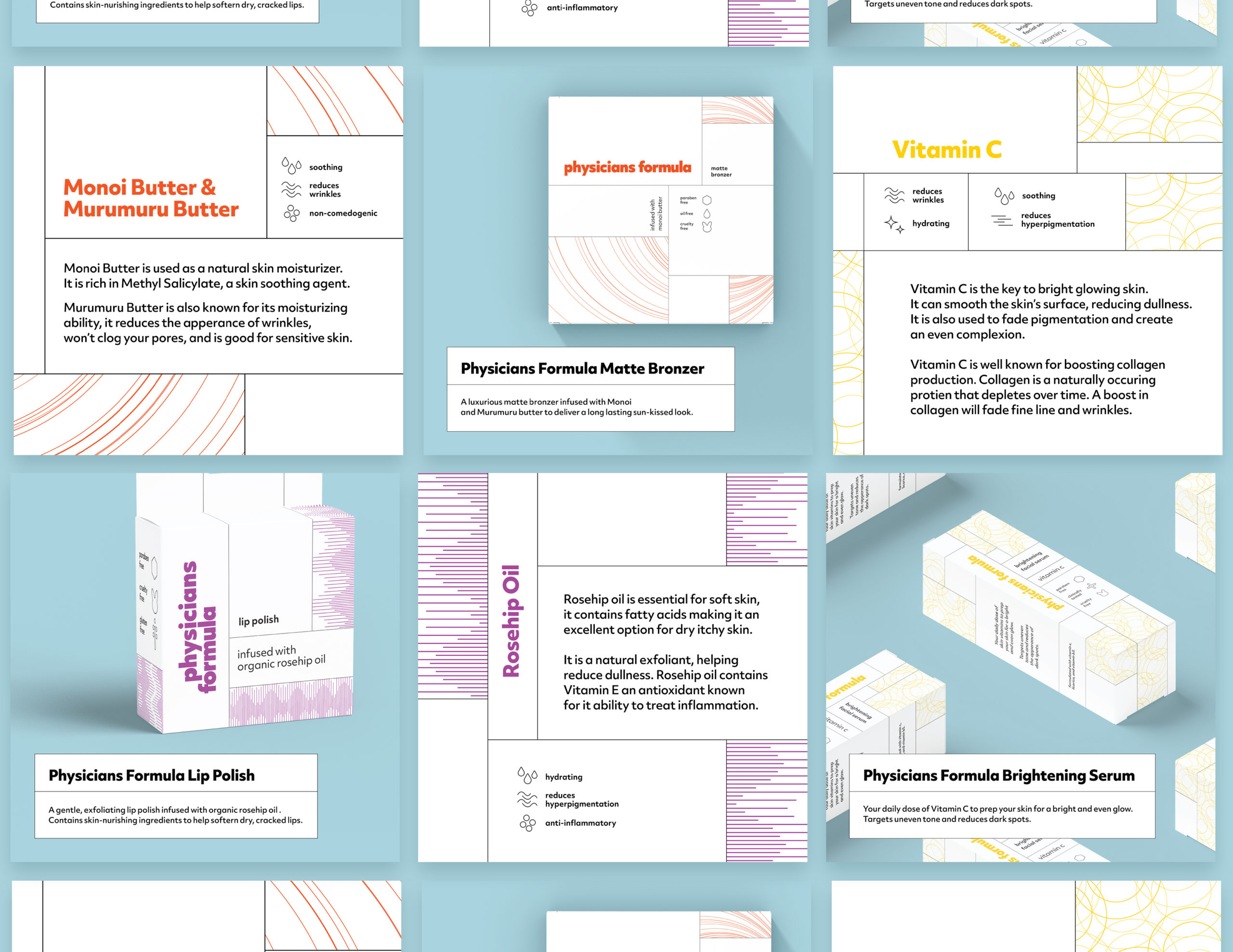
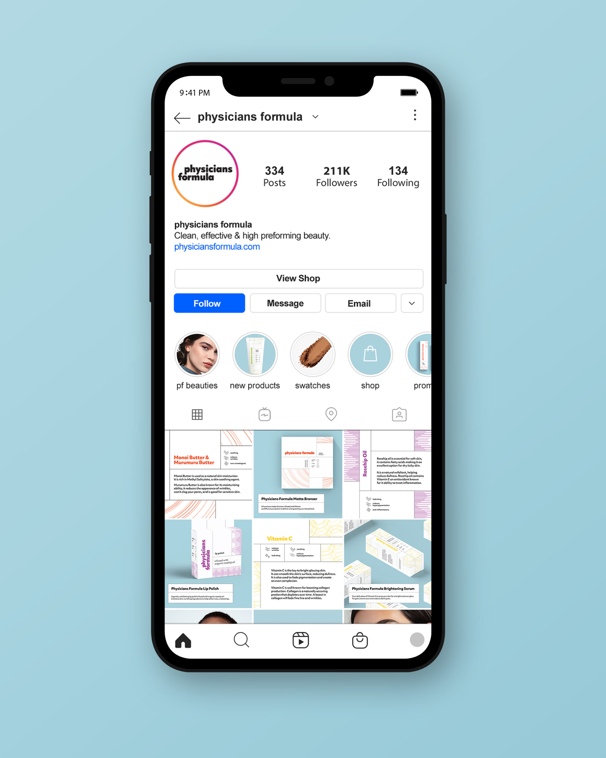
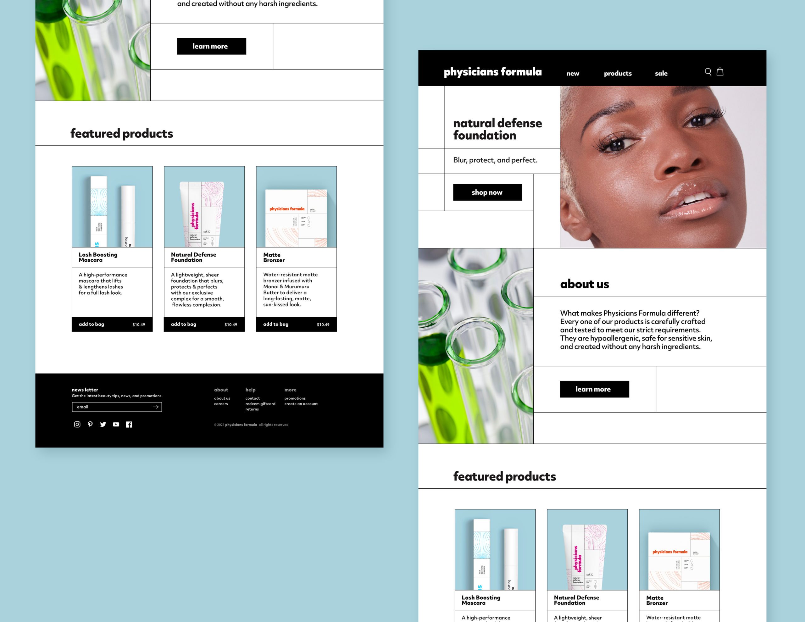
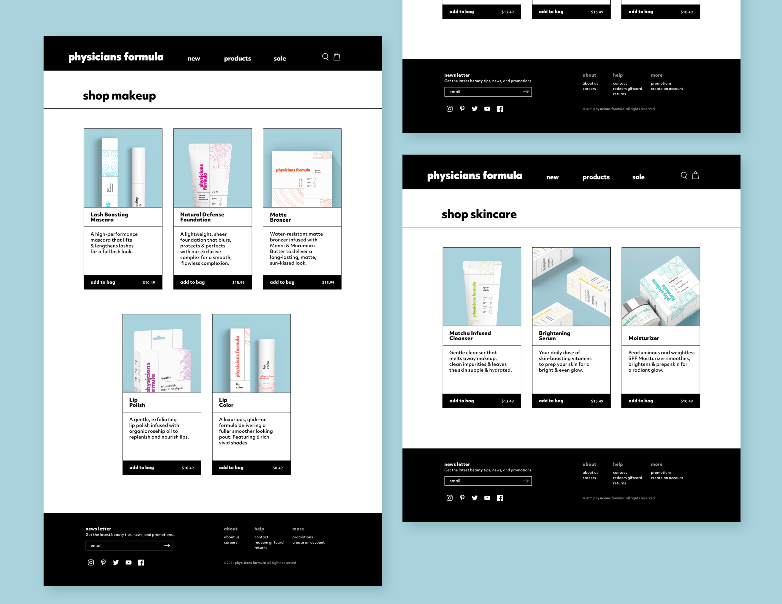
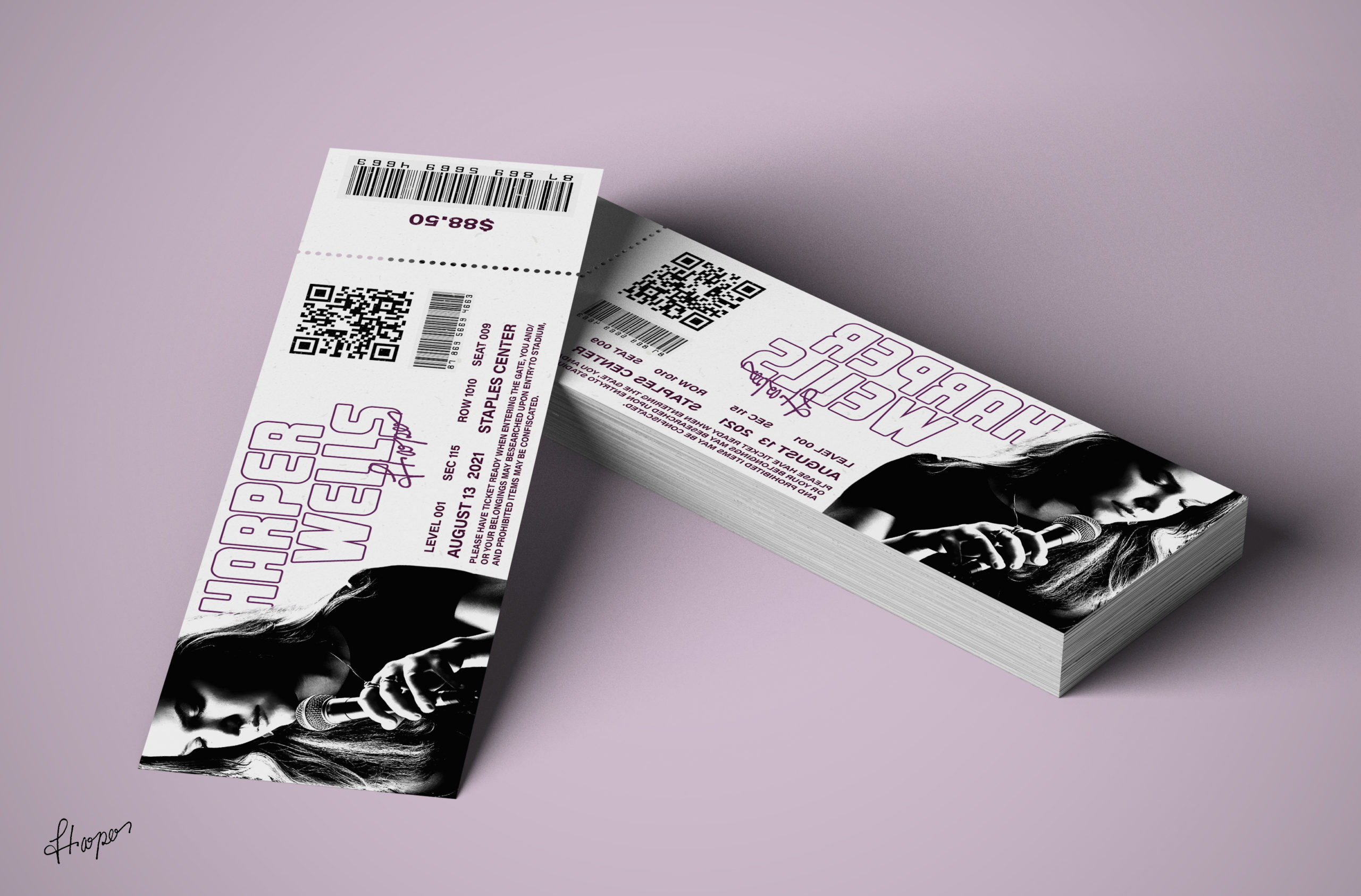
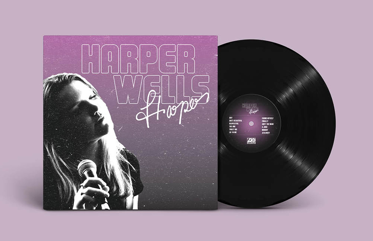
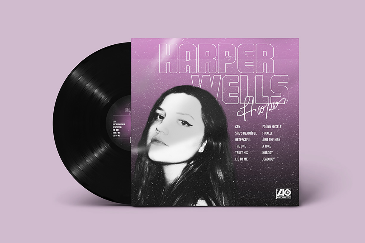
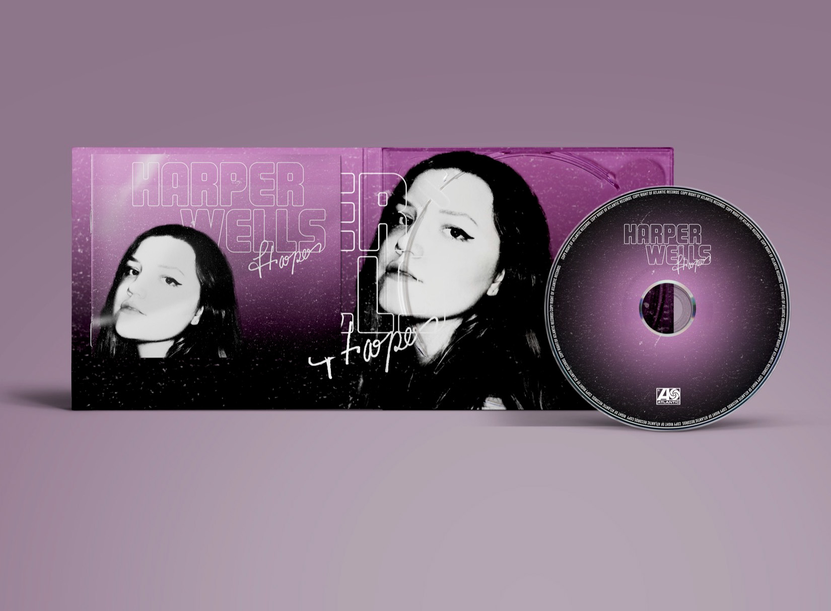
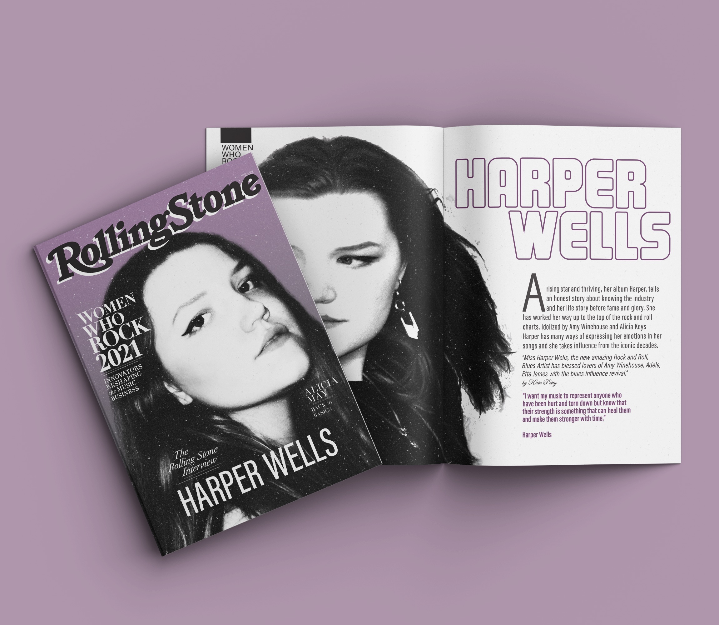
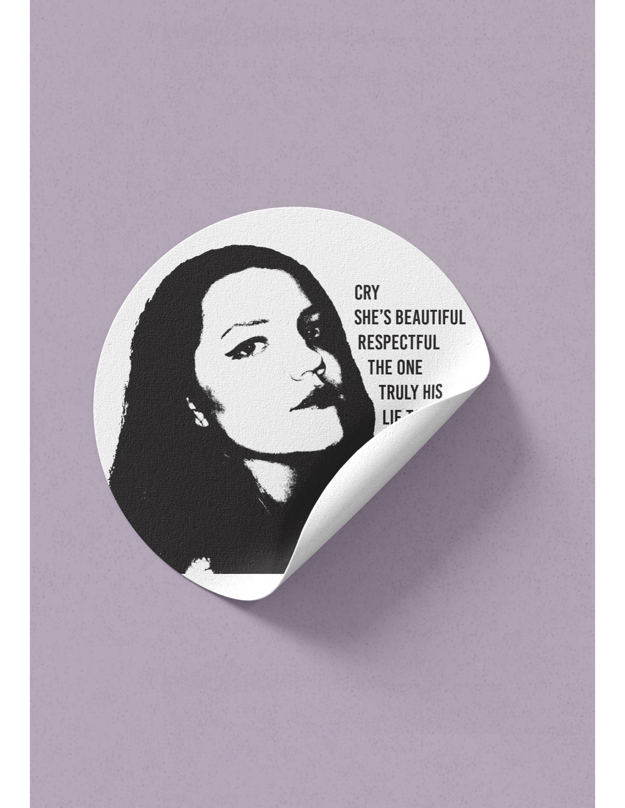
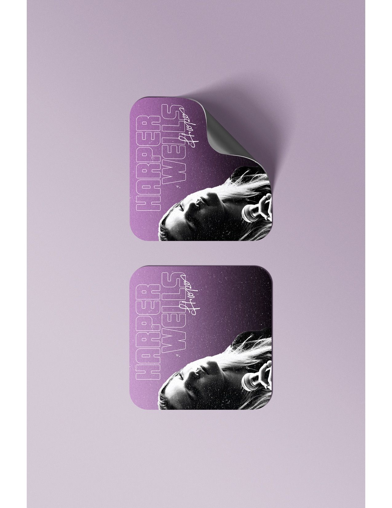
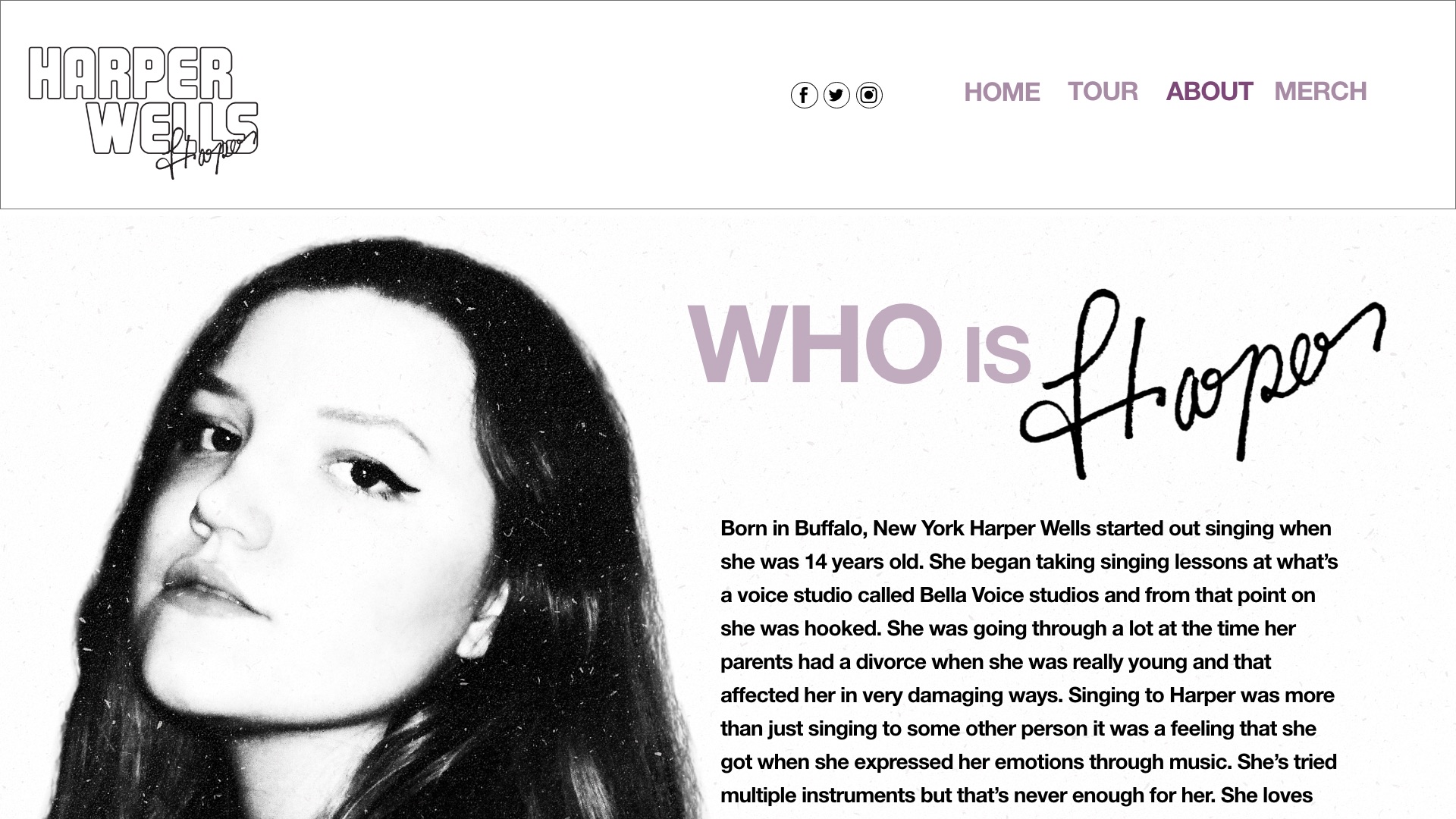
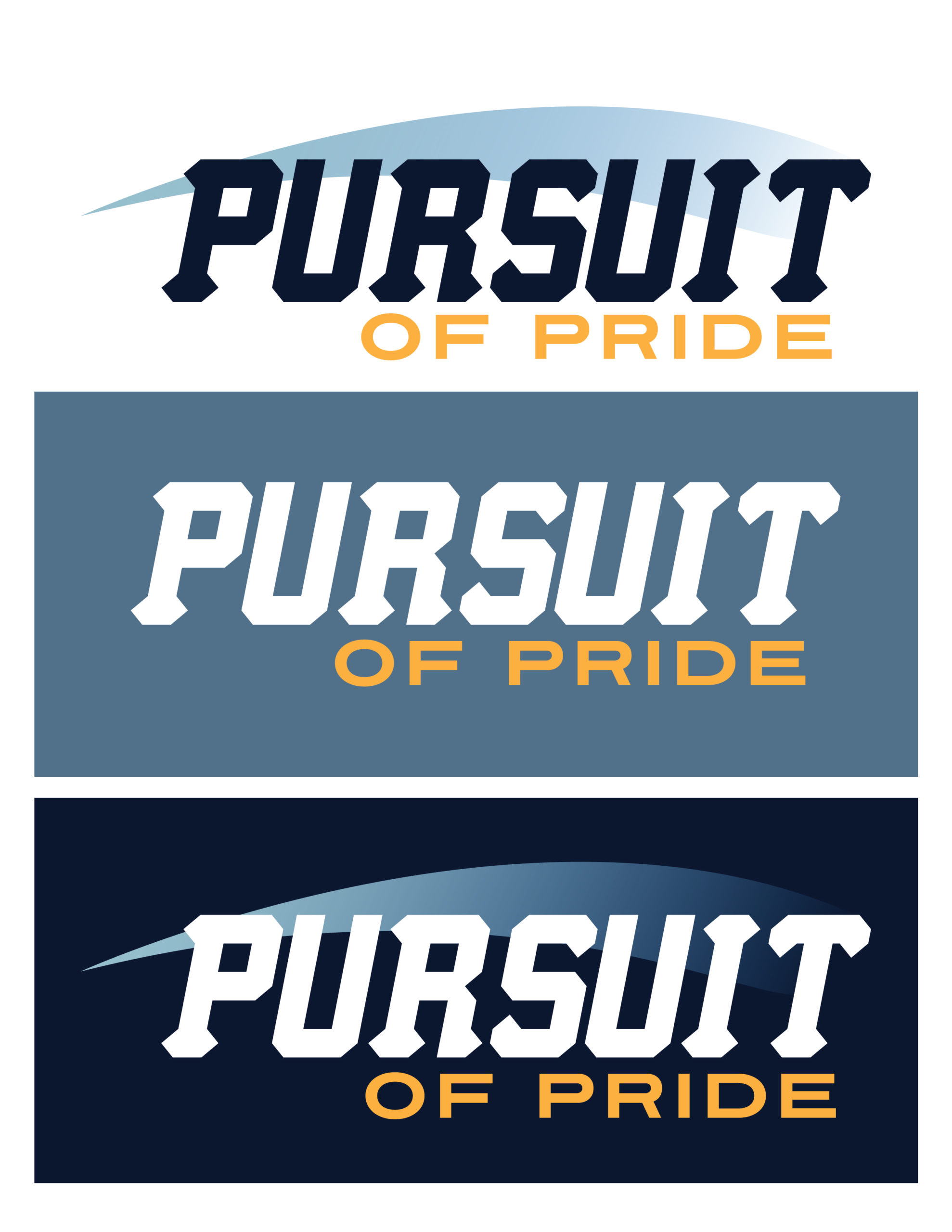
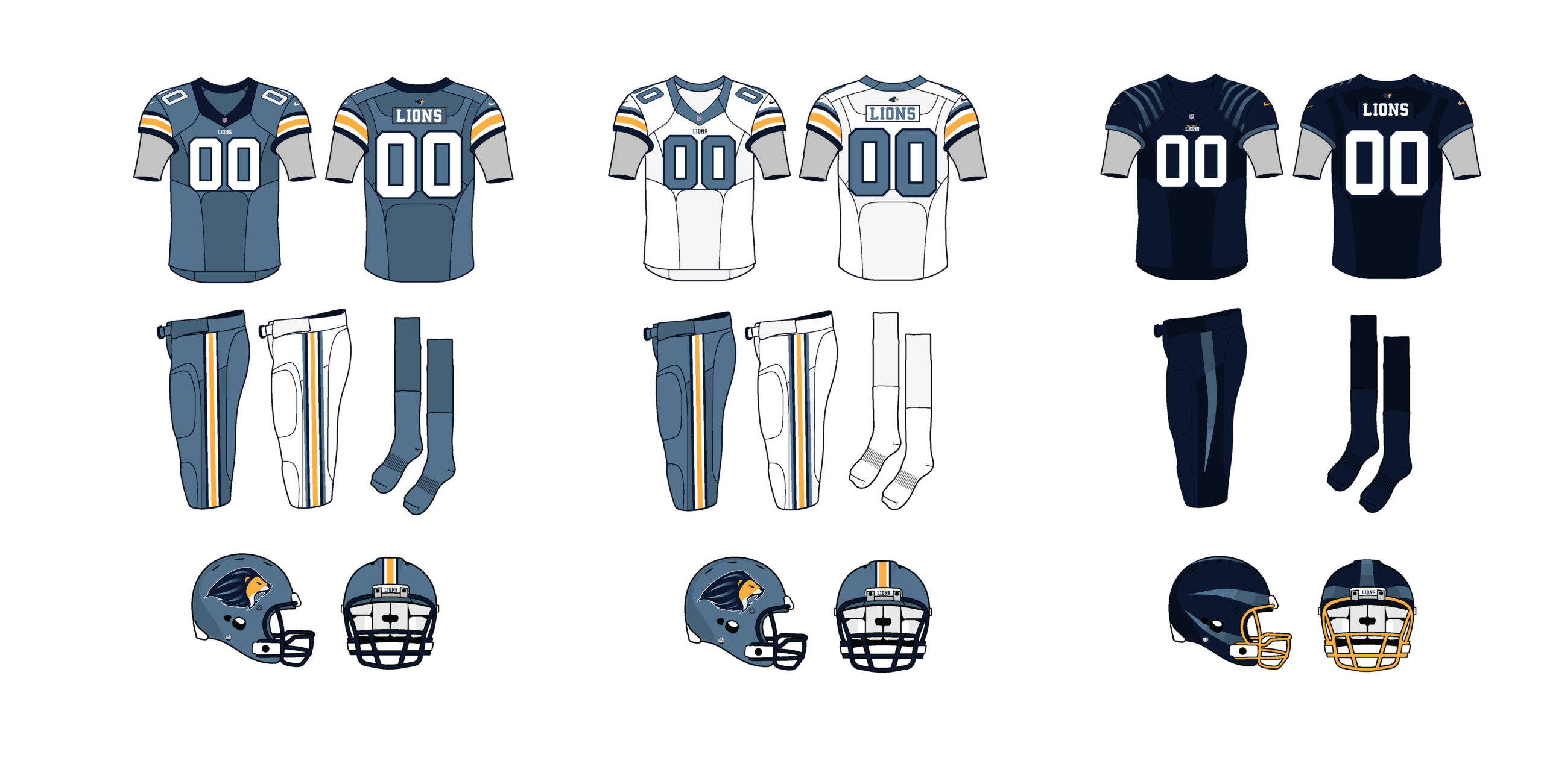
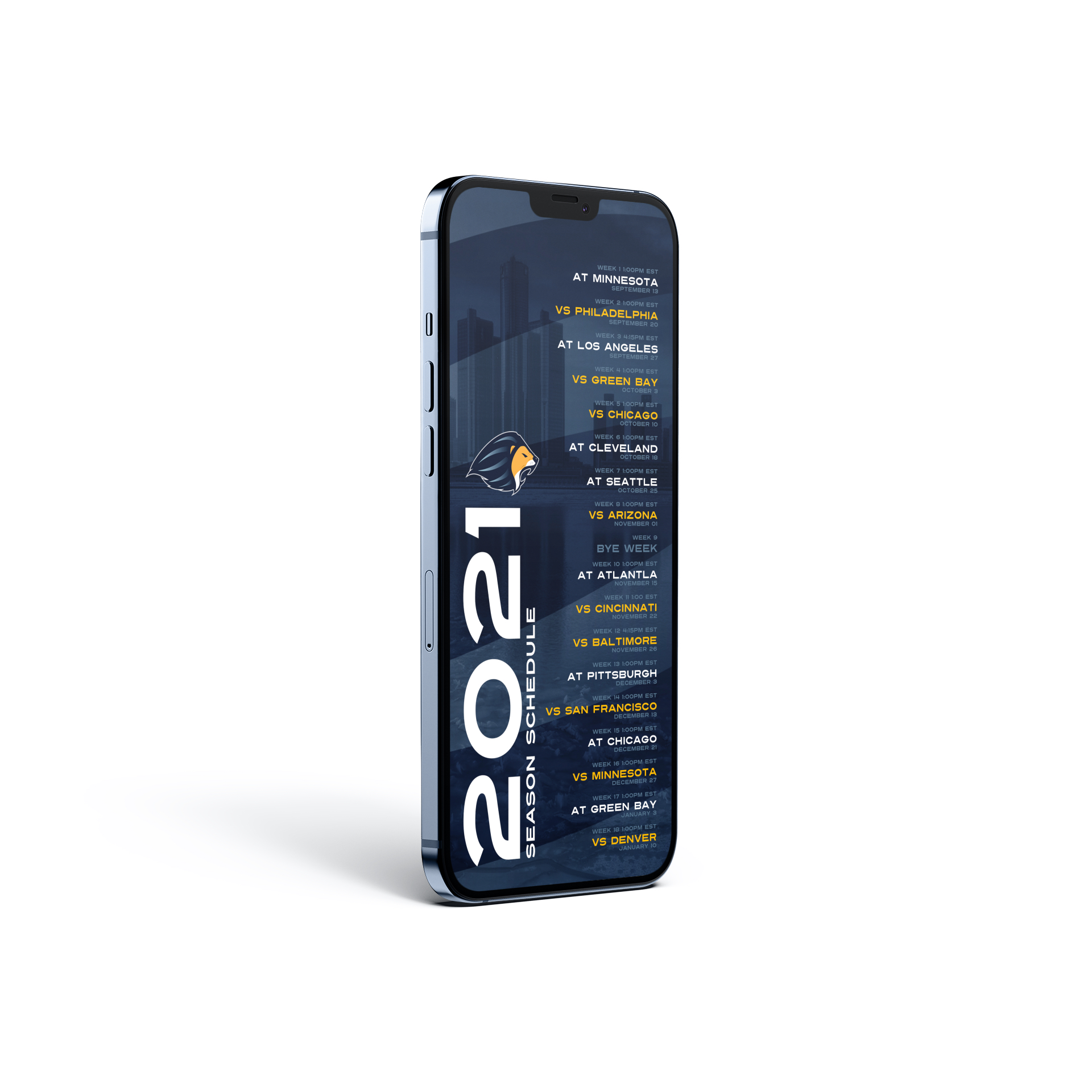
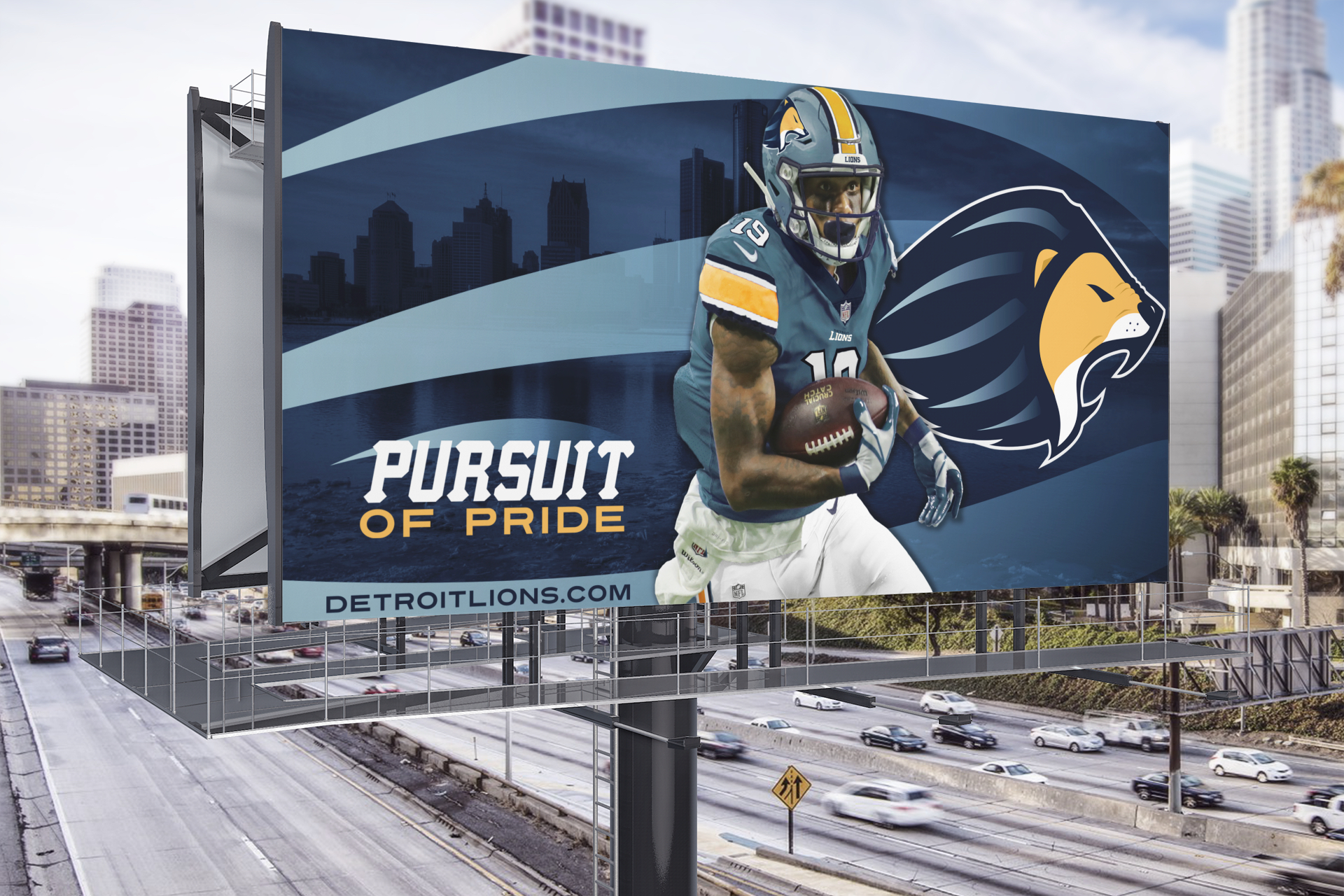
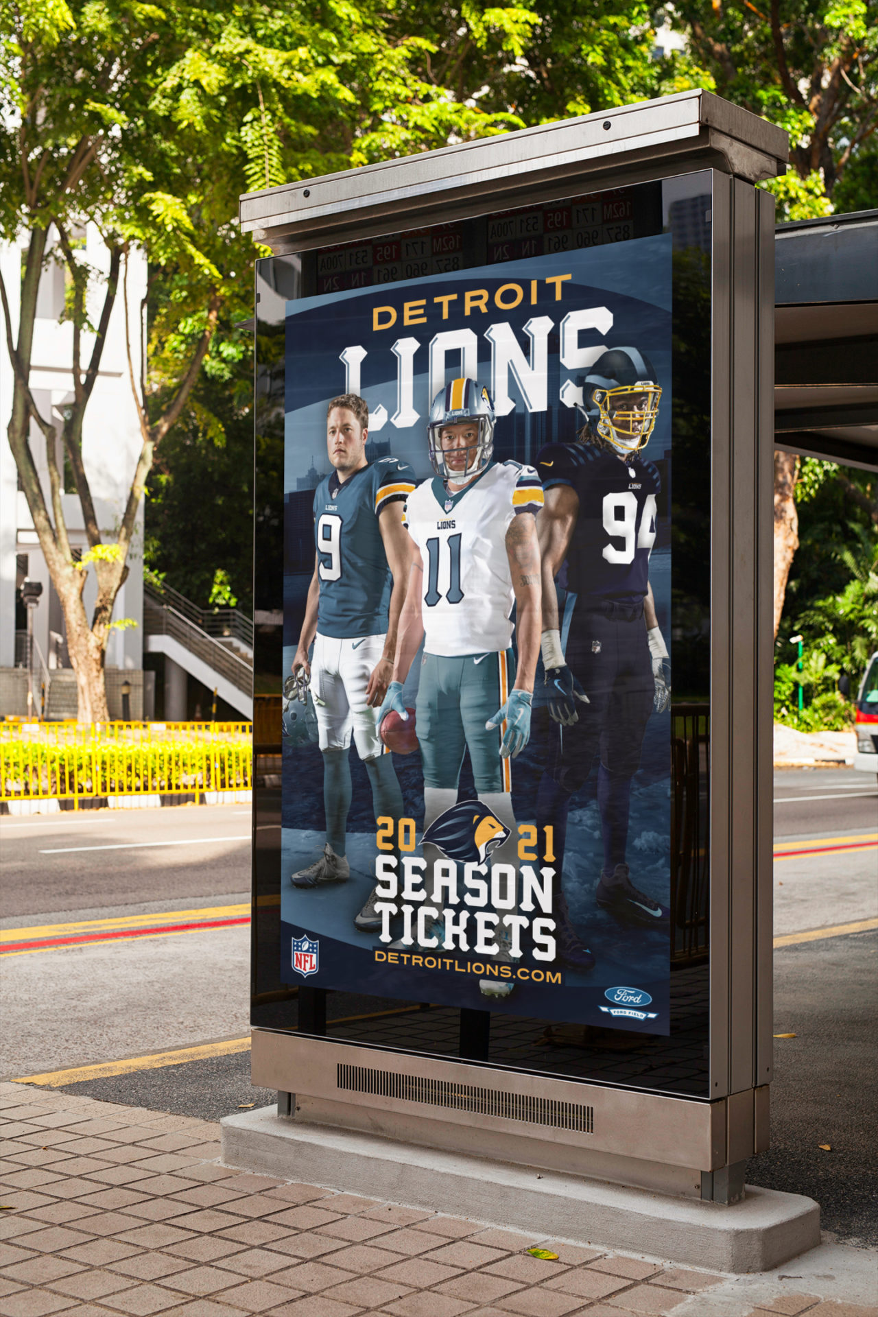
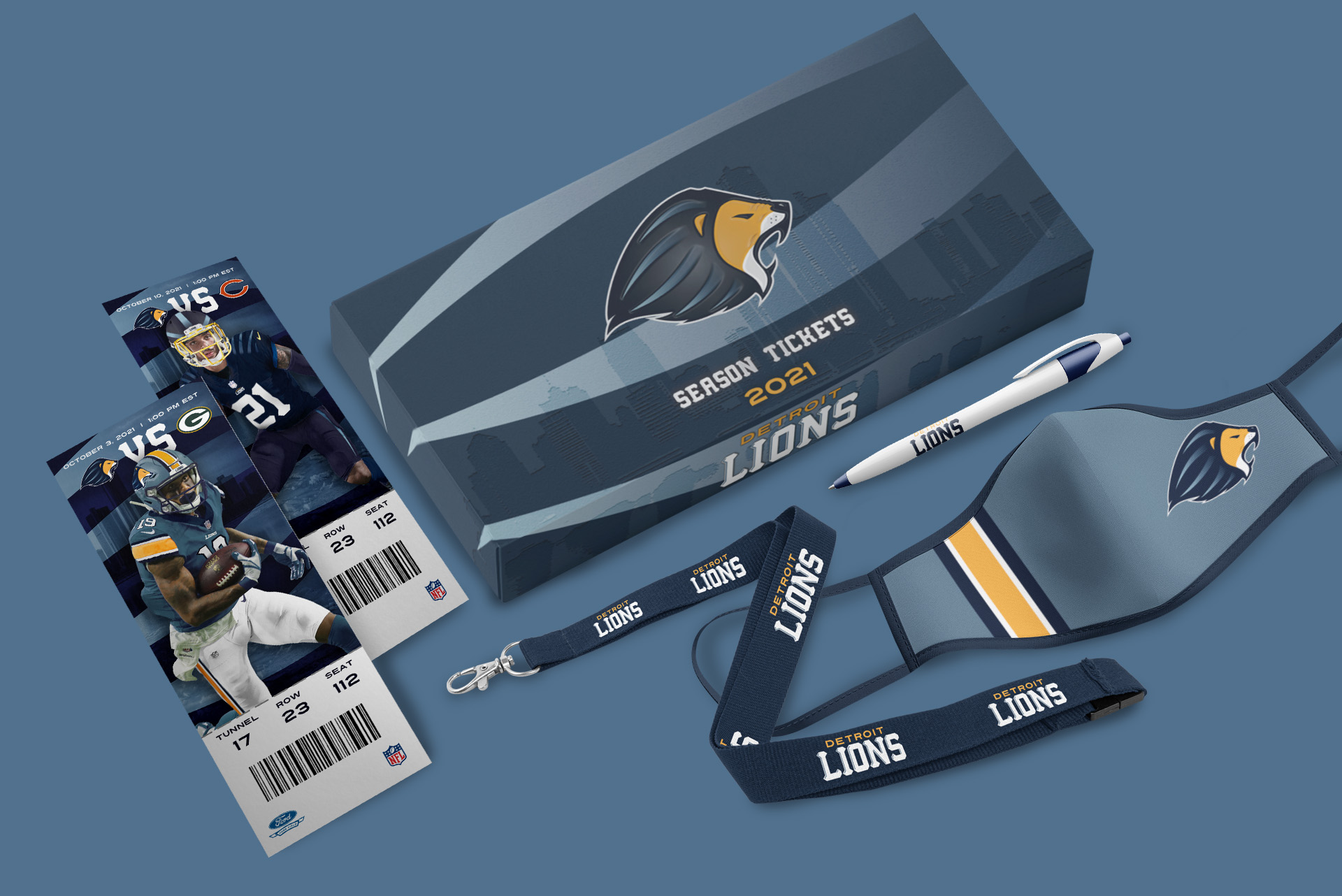
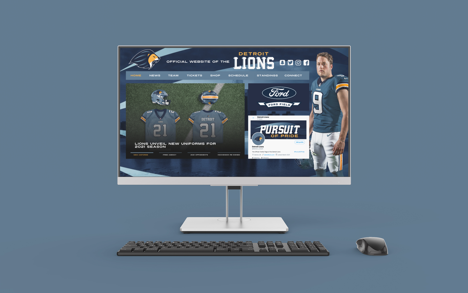
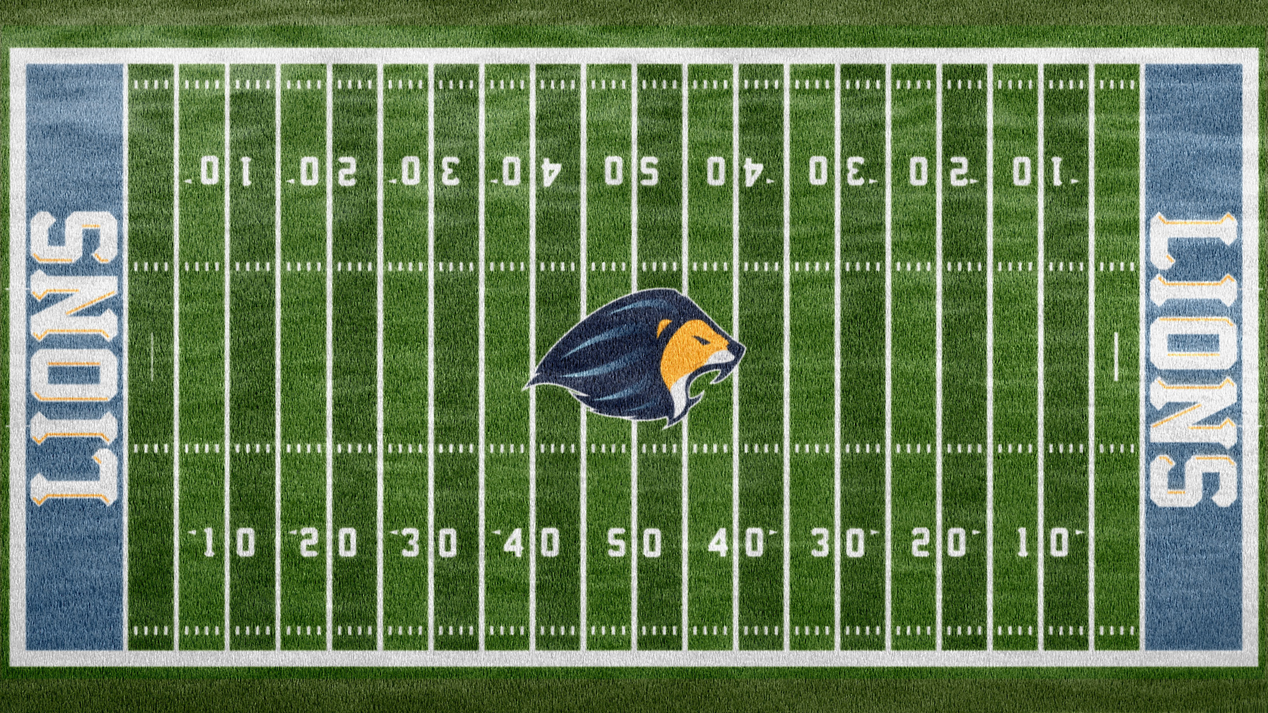
For their senior project, the BFA graphic design students at Villa Maria College produce a comprehensive body of work. It represents the culmination of the visual communication and technical skills acquired throughout their undergraduate studies. It may include the branding and/or rebranding of both original or existing products, services and businesses with materials ranging from business systems to integrated marketing campaigns that include packaging, print advertising, and website design.

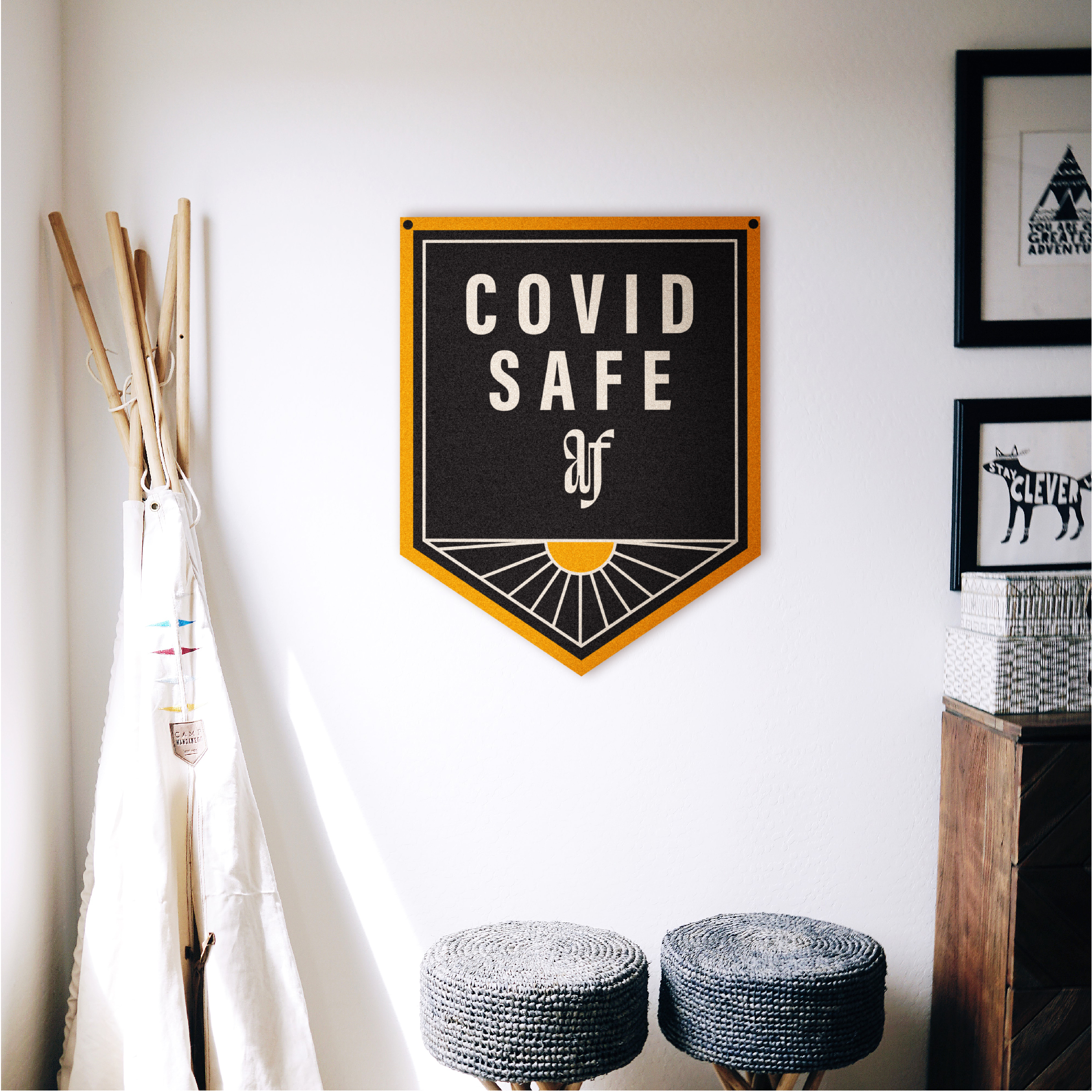
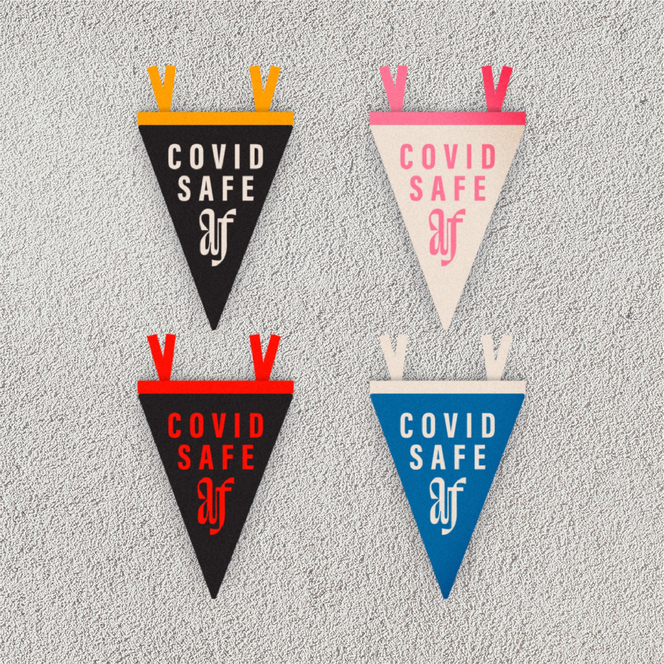
This is the 13th year that seniors have celebrated the completion of their projects at PRELUDE, our annual year-end gallery exhibition. This very popular event provides students the opportunity to showcase and display their work in a gallery setting. The venue inspires an energetic atmosphere where they meet, greet and share their successes with family, friends, classmates, college administrators, Villa alumni and area design professionals. Due to the social restrictions associated with the COVID-19 outbreak, we’re showcasing our students’ work in an online gallery format and thank you for viewing the contributions of the 2021 Prelude Exhibition.

We wish to take this opportunity to congratulate and commend Brandon, Jordan, Harper, Katie, Kim, Marty, Lindsay and Zach on their incredible accomplishment. We understand how challenging this past year  has been for each of you. We’re so very proud of the dedication and commitment you’ve shown during this unprecedented time. We hope all of you take pride in all that you’ve achieved, especially this semester and throughout your time at Villa Maria. We know the future will be bright as you pursue your goals and further develop as designers and individuals. You’re forever part of our Villa family and we wish you all the best!

Bob Grizanti
Associate Professor, Graphic Design
Chair, Fine Arts & Design Department

Julie Zack
Associate Professor, Graphic Design

Zach Huber

Kimberly Korhummel

Marty Kramer

Lindsay Neilson

Katie Steckstor

Harper Wells

Brandon Santalucia

Jordan Santalucia

Zach Huber

Plume

Plume was established as an eco-friendly boutique that allows for small candle businesses to connect with them. Instead of using standard glass, these businesses would use Plume’s premium, hand-crafted candleholders when pouring their candles. The candles would be marketed through Plume, and each package would feature a dedicated placement for the name of the small business that poured the scented candle.

Plume holders are created in a way that they can be great accent pieces in your home, on your desk or as an artisan gift. The holders can be reused and refilled with a variety of unique scents. Everything that Plume offers is constructed by a small team of craftsmen who facilitate the process by hand. Items are made from 100% recycled materials. The design aesthetic of Plume is unique in the category and boasts a gender neutral design direction. The combinations of sans serif and classic script fonts convey a vintage, yet modern energy.

Artist Bio

Zach chose graphic design because of his long-time passion for art and expressing his creative abilities to the fullest. He is intrinsically motivated to learn new techniques and technology to execute a range of visual communication. Zach takes each project and views it in its very own unique way, whether its branding, campaigns or packaging. In his free time, he loves to continue his design skills, play video games and longboard around the city of Buffalo. After graduation, Zach plans on continuing his path working as a professional and awarded graphic designer with Mirror Matter.

Kimberly Korhummel

Buffalo Creek Theater

Movies and Theatre has always been an important part of Kimberly’s life. Due to the COVID-19 pandemic, many theatres have closed, only streaming their content online. Branding a theatre space for her final project during this long period of isolation has kept Kimberly’s spirits high.

Branding Buffalo Creek Theatre was inspired by the history and culture of Buffalo, New York, where Kimberly grew up. The theatre is set in Grain Elevators located just off the Buffalo River, which contributed to the shades of blue and the “concrete” grey color pallete used for this project. These blue and grey color choices also depict the dark interior setting of theatres, along with the bright movie screen and theatre lights.

All of the film and musical posters were recreated in the Buffalo Creek brand style to stand out from the typical movie posters throughout Buffalo’s theatre scene. To achieve this, Kimberly utilized a distinctive, cohesive, and simplified illustrative style geared for moviegoers of all ages. Designing and creating these posters have helped Kimberly further expand her illustrative skills.

Artist Bio

Kimberly chose to pursue graphic design as a result of her passion for creativity, art, and design. As an empath, she has the ability to recognize the emotion and psychology of projects; allowing her to see and feel from different perspectives. She finds herself expanding ideas through hands-on experiences and deepen the process of design. She finds contributing as a team member in a small environment to be most rewarding, and she hopes to make an impact in the world with her design education.

Marty Kramer

Estilo De Vida Tequila

Tequila is something I’ve recently started enjoying but realized most of the current packaging is bland. There are so many different types of cool alcohol brands coming out but not one of them is tequila. So, I decided to create Estilo De Vida Tequila; a sophisticated brand that focuses on the traditional, time-honored techniques of tequila production. My goal was to make a product that stands out while maintaining originality at the same time. Estilo De Vida Tequila uses the blue agave plant as the main ingredient and the focal point in the visuals. I illustrated the plant to help achieve originality. The color scheme incorporates the colors of the plants giving it a cool, natural appeal with visual prominence on the shelf. Choosing a retro font complements the illustration and lends boldness to represent the taste of the tequila. Estilo De Vida Tequila stays true to the environment where it comes from, both in taste and design.

Artist Bio

Marty Kramer has always strived to stay busy. Whether it was playing a sport, taking outside art classes, or playing an instrument, he couldn’t just do nothing. Marty’s early creative nature steered him in an artistic direction. During his freshmen year of high school, he was introduced to graphic design. In class, he created commercials, logos, album covers and tons of other projects to get a feel for the field. After that experience, he knew he wanted to do that for the rest of his life. Marty plans to work as a creative in the hip-hop industry and turn his hobby creating album covers, logos and merchandise lines into a career.

Lindsay Neilson

Anode Festival

The concept behind Anode Festival grew out of the missing piece in Lindsay’s life since the COVID-19 pandemic left the world isolated: live music events. A festival like this would connect people from all over the world from the comfort of their homes to celebrate and safely enjoy 3 days of live performances. Executing a project like this also completes a full circle moment within Lindsay’s education since music has been a consistent inspiration behind her work.

With a design approach inspired by bright color palettes, photographs of warm climates, retro design, and the music itself, the bright, energetic branding of Anode Festival was developed. The use of strict grids and compartments allows elements to exist on their own and become a part of a bigger picture, much like the attendees of the festival. Decisions with typography were also heavily inspired by the 60s psychedelic movement with the main fluid display font communicating the groovy, electronic sound of the artists in the lineup. Paired with the display font is variable sans serif type that communicates stability for headlines while balancing legibility and a complimentary personality throughout the body copy.

Artist Bio

Even as a little kid, Lindsay was always creating. It wasn’t until she was in high school that music motivated her creativity and sparked a deep interest in design; this is still what she loves to do. Her high creative energy and curiosity didn’t stop there but formed into a love of other disciplines such as illustration, photography, video editing, and animation. There was a piece she also found within all that; the skill of effectively connecting viewers to the work. It would become a driving force in all her creative work moving forward. You can still find the coffee-driven creative drawing inspiration from music as well as urban environments, retro design, and nature.

Katie Steckstor

Physicians Formula

Physicians formula is a beauty brand with a focus on creating healthy cosmetics. I want consumers to choose Physicians Formula based on its quality and ingredients, supported by calculated visuals. The overall aesthetic is clean and scientific coupled with unique illustrations and pops of color.

The branding highlights the lack of harsh chemicals within the products. The personality of the company becomes clean, geometric, and scientific through the re-branding process. It balances a clinical feeling to portray the idea of formulation with an organic wellness for the individual. These elements led to the incorporation of bold type, high contrast colors, and de stijl inspired layouts. Point, line, and plane illustrations were added to create visual interest and texture.

Physicians Formula is committed to creating products that will become a staple in daily beauty routines. The products and collateral speak to the pristine nature of the brand and highlight the intellectual standards of our company.

Artist Bio

Katie grew up with a fascination towards art, but didn’t discover graphic design until she took a design class late in high school. It quickly became her passion and led her to pursue an education in the field. She is driven by the possibility of creating memorable work and evolving her skill set. Katie is excited to see where her creativity and love for the arts will take her.

Harper Raymond

Harper Wells

I’ve been training as a singer for over seven years and a designer for four. For my senior thesis, I wanted to brand and market my talent as a R&B soul singer and songwriter. My unique vocal style is passionate, soulful, smokey, and bluesy, similar to Alicia Keys, Amy Winehouse, and Christina Aguilera. Applying a visual sense of grittiness using gradient textures and a monochromatic color palette symbolizes my bold personality and music style. The sleek typographic choices and high contrast elements unify the design as a whole.

Artist Bio

Harper Wells grew up in the old town of Elma, New York with not much to do and discovered a love and gift for music and art at a young age. As a result of her experience with voice lessons and singing on stage, she developed confidence and what she hopes to be a life-long endeavor. Following her other passion, Harper pursued a degree in interior design at Villa Maria College. She soon realized that she and graphic design were more compatible. Harper found her true calling and hopes for a bright future in graphic design.

Jordan Santalucia

Artist Bio

From an early age, Jordan was enthralled with the aesthetics of the sports industry. From colors to logos to uniforms, he was captivated by the ability to convey a specific emotion or energy, just by the teams’ appearance. Jordan began his love for design from his fascination over hockey goalie equipment. In 2010, he painted his twin brother’s street hockey pads and 19 years later, he designed a goalie helmet for a professional women’s hockey goaltender. Currently living in a sports-crazed city like Buffalo, Jordan is excited to see where his passion for sports graphic design will take him.

Brandon Santalucia

Artist Bio

Brandon was drawn to graphic design at a young age, whether he knew it or not. He noticed elements of design for as long as he can remember, mainly in the form of sports design. Most of his passion for visual communication revolves around branding for athletic teams. The logos, colors, and uniforms have always been a source of enjoyment and inspiration. During Brandon’s childhood he would create his own teams and visual identity to support them. He eventually became aware that he could pursue graphic design in college, and that he could continue his passions for creativity, branding, and design for the athletic industry as a career.

Joint Artist Statement

The Detroit Lions

The Detroit Lions are one of the most well-known teams in the National Football League. As one of the oldest franchises, The Lions have been active for over 90 years and have yet to win a Super Bowl Championship. A resurgence in culture is long-overdue, and a new brand can serve as the launching pad to a more positive outlook for the organization. The updated brand is a modern revamp with an emphasis on progression. The rich history, loyal following, and longevity has also been acknowledged. Elements of the city and the team’s traditions are included to appeal to the fans that the Lions have cultivated over the decades. The solution balances classic and modern with eye-catching and sophisticated. Finding the right mix of tradition and trend while retaining recognizable components was crucial to getting the look to represent the team and city for the foreseeable future.